Card hub + social
For any AI or builder
- Read this file first. It is the build contract and the QA checklist for design 003.
- Build every page in pages[]; every module in modules[] must exist with the listed elements, interactions and states.
- Apply rules R1–R9. Where a comp (comps/*.dc.html or screens/*.png) differs from a rule or from a page's v2_changes, the rule wins.
- Use only semantic --fm-* tokens from tokens.json / design-003.css. No hex, px, radius or font literals in components. This is what makes user themes work.
- Validate by walking acceptance[] for each page; record pass/fail per line with page id + index (e.g. contract-detail#7).
- Data marked 'sample' must come from real tables in the build or show an empty state. Never ship SampleChip or sample members.
- Keep catalog shared rules: comments box on every page, plan tiles (B/P) after paid tools, naming (Match-M8, FedM8 AI · not a member, room, Post).
Owner decisions
- Theme picked: style 04 "Card hub + social" (Nov 2, 2026). Applies to the whole logged-in app (fedm8.com/os).
- Users must be able to change their UX style on the fly (runtime theming). Every visual value is a token. No hard-coded colours, sizes, radii or fonts in components.
- Reddit-style discussion around everything; join any contract/grant as Prime / Sub / 1099; per-requirement "I can do this"; strong social presence.
- Veterans, Learn and Community (Forum) never hidden behind an "All tools" menu. No "Tap ? for help" hints. Few words, more icons.
- Chevron = arrow-segment step bar; used for walk-throughs and as breadcrumbs (depth ≥2).
- Walk-throughs TurboTax-simple: one question per screen, obvious progress, easy back/forward.
- FEDM8 LLC claims no SDVOSB status (not yet SBA-certified; no VetCert application on file as of 2026-11-08) — never shown as certified, pending or in review.
- Veterans get 3 months Pro free at sign-up. Pro = contact roster members, AI proposal writer, AI requirement summaries, past-pay lookups.
- Never invent contract summaries, award amounts, fit scores. Missing data → explicit placeholder/loading state.
Rules that override the comps
- R1 Navy (`--fm-nav-active-bg` / `--fm-selected-bg`) marks only "where you are": active nav pill, selected choice card. Selected list rows use `--fm-row-selected-bg` (cream tint) + bold title, never navy.
- R2 Exactly one primary action per screen, styled `--fm-action`, placed top-right of the focus area (wizards: bottom-right). All other actions outline or text.
- R3 Detail pages (contract, grant) order: Title + countdown → Summary (BLUF) → Can you do this? → Join as → Discussion. Facts collapse to one FactLine.
- R4 ChevronBreadcrumb only at depth ≥2. Top-level pages start with the H1.
- R5 Urgency colour: ≤48h `--fm-urgent`, ≤7 days `--fm-warn`, later neutral. Same on every surface.
- R6 Choice cards: label first (type-lg), count second (type-md, muted, with unit word). Big numbers only on Home StatCards.
- R7 Chips: two states only — selected (`--fm-chip-selected-bg`) and unselected (outline). Never navy-filled chips.
- R8 Minimum meta text 13px (`--fm-text-sm`) at contrast ≥4.5:1.
- R9 No unknown-count placeholders shown as large numbers; hide the number or show real data.
Change the look — live
Theming acceptance
Semantic colour tokens × presets
| Token | Name | Use | Card hub | High contrast | Dark | |
|---|---|---|---|---|---|---|
--fm-bg | Ground | Page behind cards | #f3f1ec | #ffffff | #0f1726 | |
--fm-surface | Surface | Cards, header, fields, dialogs | #ffffff | #ffffff | #172238 | |
--fm-surface-alt | Surface alt | Highlight cards, claim bar, continue card | #fffaf0 | #fff6e0 | #1d2a44 | |
--fm-line | Line | Hairlines, card edges | #e0dccf | #5b6475 | #2c3c5c | |
--fm-line-strong | Line strong | Dashed empty states, disabled edges | #8b8676 | #3a4152 | #7085ad | |
--fm-ink | Ink | Primary text, headings | #14284b | #000814 | #eef2f8 | |
--fm-ink-2 | Ink 2 | Secondary text | #3d4f6e | #1b2a44 | #c6d0e2 | |
--fm-ink-3 | Ink 3 | Meta text (min 13px) | #4a5b78 | #26334d | #a9b6cd | |
--fm-on-dark | On dark | Text on navy/selected fills | #ffffff | #ffffff | #0f1726 | |
--fm-nav-active-bg | Nav active | Active nav pill, current chevron segment | #14284b | #000814 | #e8edf6 | |
--fm-nav-active-ink | Nav active ink | Text on active nav | #ffffff | #ffffff | #14284b | |
--fm-selected-bg | Selected | Selected ChoiceCard | #14284b | #000814 | #e8edf6 | |
--fm-selected-ink | Selected ink | Text on selected card | #ffffff | #ffffff | #14284b | |
--fm-row-selected-bg | Row selected | Selected list row / chat item (R1) | #fdf3dc | #ffe7a8 | #26365a | |
--fm-row-selected-ink | Row selected ink | Text on selected row | #14284b | #000814 | #eef2f8 | |
--fm-action | Action | The one primary button per screen (R2) | #f5a524 | #ffb020 | #f5a524 | |
--fm-action-ink | Action ink | Text on primary button | #14284b | #000814 | #14284b | |
--fm-action-hover | Action hover | Primary button hover | #e0951a | #e89a00 | #ffb948 | |
--fm-accent-soft | Accent soft | Badges, chevron middle segment, highlights | #fde3b0 | #ffe7a8 | #3a2e16 | |
--fm-accent-ink | Accent ink | Text on accent soft | #8a4b00 | #5a3000 | #f5c46b | |
--fm-chip-selected-bg | Chip selected | Selected filter chip (R7) | #fde3b0 | #ffe7a8 | #3a2e16 | |
--fm-chip-selected-ink | Chip selected ink | Text on selected chip | #14284b | #000814 | #f5c46b | |
--fm-success | Success | I can do this ON, checks, online dot | #1f6b4a | #0b4d31 | #6fd3a3 | |
--fm-success-soft | Success soft | Accepted answer, success fills | #e3f1ea | #d4f0e2 | #163328 | |
--fm-pro | Pro | Pro plan tile, FedM8 AI badge | #5b3a8a | #3f1f70 | #c7a8f0 | |
--fm-pro-soft | Pro soft | Pro/AI fills | #efe8f7 | #ebe0fa | #2a2140 | |
--fm-urgent | Urgent | Due ≤48h (R5) | #a3262a | #7a0a0f | #ff9a9a | |
--fm-urgent-soft | Urgent soft | Urgent chip fill | #fbe3e3 | #ffd9d9 | #3a1d22 | |
--fm-warn | Warn | Due ≤7 days (R5) | #8a4b00 | #5a3000 | #f5c46b | |
--fm-warn-soft | Warn soft | Warn chip fill | #fde3b0 | #ffe7a8 | #3a2e16 | |
--fm-info-soft | Info soft | Neutral type badges | #eaf0fb | #dde8ff | #1f2d4a | |
--fm-focus-ring | Focus ring | Keyboard focus, 2px, never removed | #1d4ed8 | #0033cc | #8fb4ff |
Pages
Contract detail
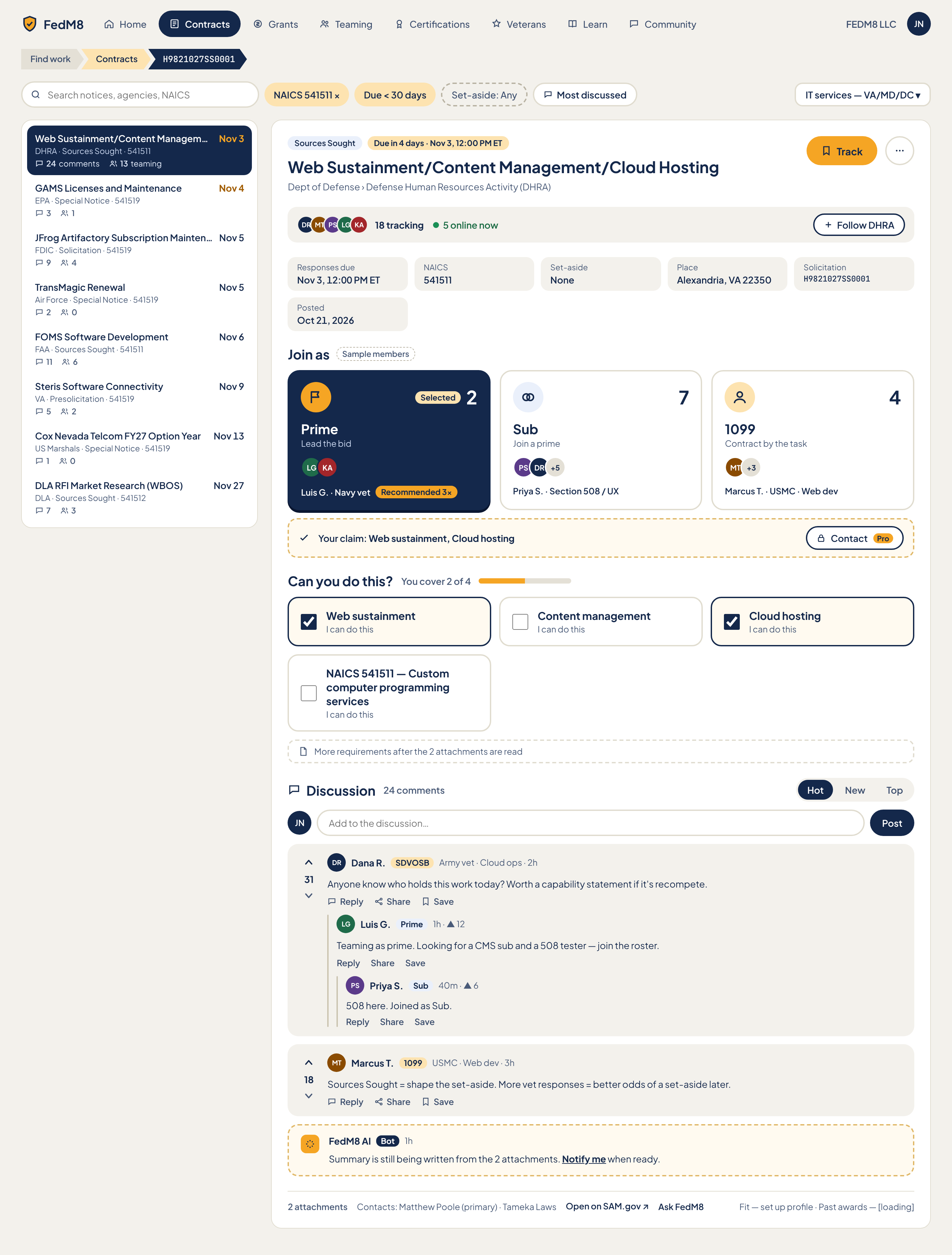
Eye path (after rules)
- 1 Title + CountdownBanner ('Due tomorrow, 12:00 PM ET', urgency-coloured per R5) with Track button top-right
- 2 SummaryCard (AI BLUF; pending/loading/ready/failed) plus one-line FactLine (NAICS · set-aside · place · solicitation # · posted)
- 3 Can you do this? (RequirementToggles + CoverageMeter)
- 4 Join as (3 ChoiceCards Prime/Sub/1099) then ClaimBar
- 5 Discussion (Composer, SortTabs, threads, FedM8 AI BotPost)
- Side context, never competing: notice list on the left (selected row cream, not navy), TrackingBar and links in the header, 'Who is here' presence
Change from the comp
- R1 selected list row becomes cream tint + bold title; navy only on active nav pill and selected Join-as card
- R3 reorder: title+countdown, Summary, Can you do this?, Join as, Discussion
- R3 six fact tiles collapse to one FactLine; orphan 'Posted' tile removed
- R2 Track is the only amber button; Post, Follow, Contact are outline
- R5 large countdown under title ('Due tomorrow 12:00 PM ET') replaces small chip; list rows use same urgency colours
- R6 Join-as label first, count second with unit word
- R7 filter chips two-state only
- R8 meta text >= 13px at 4.5:1
- R9 '[loading]' and unknown counts hidden or skeleton, not shown as text
- Remove 'Sample members' chip in production
- Recommended 3x chip only when notable
Modules (16)
- 0. App header and primary nav
AppHeader + PillNavheader- FedM8 shield logo + wordmark (home link)
- NavPills with icons: Home, Contracts, Grants, Teaming, Certifications, Veterans, Learn, Community (all 8 always visible, none behind an 'All tools' menu)
- Active pill = Contracts (navy fill, white ink)
- WorkspaceSwitcher showing 'FEDM8 LLC'
- Avatar 'JN' (account menu)
- click pill navigates to that area
- WorkspaceSwitcher opens workspace list
- Avatar opens account menu (profile, settings, sign out)
- Tab order: logo, pills, switcher, avatar
- 1. Breadcrumb
ChevronBreadcrumbheader- Arrow-segment chevrons: Find work > Contracts > solicitation number
- Last segment = current page, not a link
- click 'Find work' goes to Find work hub
- click 'Contracts' goes to contract list/search
- keyboard focusable segments
- 2. Search and filters
SearchField + FilterChip + SavedSearchChipleft- SearchField placeholder 'Search notices'
- FilterChips: NAICS 541511 (removable x), Due < 30 days, Set-aside: Any
- Saved search chip 'IT services - VA/MD/DC' with dropdown caret
- Sort control 'Most discussed' with icon
- typing filters list (debounced)
- chip toggles selected/unselected (two states only, R7)
- x on NAICS chip removes it
- saved search chip applies all its filters
- sort menu: Most discussed, Due soonest, Newest
- 3. Notice list
NoticeRow x8 in ThreadList-style listleft social- 8 rows: title, agency, notice type, NAICS, due date, UrgencyChip, comment count icon+number, teaming count icon+number
- Rows in comp: DHRA Web Sustainment (Nov 3, 24/13), EPA GAMS (Nov 4, 3/1), FDIC JFrog (Nov 5, 9/4), Air Force TransMagic (Nov 5, 2/2), FAA FOMS (Nov 6, 11/6), VA Steris (Nov 9, 5/2), US Marshals Cox Nevada (Nov 13, 1/0), DLA RFI (Nov 27, 7/3)
- Selected row = cream tint + bold title (R1)
- click row loads detail in main pane and updates breadcrumb/route
- arrow keys move selection
- urgency colour by days left (R5): <=48h urgent, <=7d warn, later neutral
- 4. Detail header
PageTitle + TypeBadge + Track PrimaryButtonmain- TypeBadge 'Sources Sought'
- Title 'Web Sustainment/Content Management/Cloud Hosting'
- Agency path 'Dept of Defense > Defense Human Resources Activity (DHRA)'
- Track PrimaryButton (amber) top-right
- IconButton 'More actions' (kebab)
- Track adds notice to My pipeline (stage Watching) and changes to 'Tracking'
- More actions: copy link, share to Community, mute
- keyboard: Track reachable first in header
- 5. Countdown
CountdownBanner + UrgencyChipmain- Large text 'Due tomorrow, 12:00 PM ET' (replaces the small 'Due in 4 days' chip; comp shows 'Due in 4 days . Nov 3, 12:00 PM ET', compute live)
- Colour by R5
- updates without reload as time passes
- click adds to calendar (text button)
- 6. Tracking bar
TrackingBar + AvatarStack + FollowButtonmain social- AvatarStack DR MT PS LG KA
- '18 tracking' and '5 online now' with PresenceDot
- Follow DHRA button (outline) to follow the agency
- click stack opens roster drawer
- Follow DHRA toggles to 'Following'
- hover avatar shows name and role
- 7. AI summary (BLUF)
SummaryCardmain Pro- BLUF text from AI
- States badge: pending/loading/ready/failed
- Comp state: 'Summary is still being written from the 2 attachments' with 'Notify me when ready'
- Pro tag (AI requirement summaries are Pro)
- Notify me when ready subscribes user (text button)
- Retry on failed
- never shows invented summary
- 8. Fact line
FactLinemain- Single line: Responses due Nov 3, 12:00 PM ET . NAICS 541511 . Set-aside None . Alexandria, VA 22350 . Solicitation H9821027SS0001
- 'Posted Oct 21, 2026' is folded in (orphan tile removed)
- NAICS value links to NAICS filter
- text selectable
- 9. Can you do this?
RequirementToggle list + CoverageMetermain social- Heading 'Can you do this?' and meter 'You cover 2 of 4'
- 4 toggles: Web sustainment, Content management, Cloud hosting, NAICS 541511 - Custom computer programming services (each 'I can do this', ON = --fm-success-soft)
- Note 'More requirements after the 2 attachments are read'
- toggle sets I can do this and updates meter and ClaimBar
- state persists per user per notice
- keyboard Space toggles, aria-pressed
- 10. Join as
JoinAsPicker (3 ChoiceCards)main social- Cards: Prime 'Lead the bid' (2), Sub 'Join a prime' (7), 1099 'Contract by the task' (4)
- Label first (type-lg), count second with unit word e.g. '2 members' (R6)
- AvatarStack per role with +N
- Names line e.g. 'Luis G. . Navy vet', 'Priya S. . Section 508 / UX', 'Marcus T. . USMC . Web dev'
- 'Recommended 3x' chip only on the card where it stands out (not on all)
- Selected card = navy, Prime shown selected in comp
- click selects role (one at a time) and updates ClaimBar
- click again opens roster lane for that role
- Recommended chip shown only if recommendation exists
- 11. Claim bar
ClaimBar + ProLockmain Pro social- 'Your claim: Web sustainment, Cloud hosting' (from toggles)
- Contact button with Pro tag (contact roster members)
- Contact opens message composer to roster members if Pro
- non-Pro opens upgrade drawer (ProLock)
- claim text updates live
- 12. Discussion
ThreadList + Composer + SortTabs + ThreadPost + VoteRailmain social- Header 'Discussion' and '24 comments'
- SortTabs Hot / New / Top
- Composer: avatar JN, 'Add to the discussion', Post button (outline)
- Post 1 Dana R. SDVOSB Army vet . Cloud ops . 2h, vote 31, body, Reply/Share/Save
- Nested: Luis G. Prime 1h up 12; Priya S. Sub 40m up 6 (thread line)
- Post 2 Marcus T. 1099 USMC . Web dev . 3h, vote 18
- Up/Down vote buttons with aria labels
- sort changes order
- vote toggles up/down once per user
- Reply opens inline composer
- Share copies link/posts to Community
- Save bookmarks
- Post submits and appends
- 13. FedM8 AI bot post
BotPostmain social- Bot avatar, 'FedM8 AI' with Bot tag (--fm-pro), 1h
- Message 'Summary is still being written from the 2 attachments' with Notify me when ready
- Notify me subscribes
- replaced by summary post when ready
- 14. Source and attachments
FileCard + TextButtonright Pro- '2 attachments' count/link
- Contacts: Matthew Poole (primary) . Tameka Laws
- Open on SAM.gov external link
- Ask FedM8 button (AI question, Pro)
- Fit line: 'Fit - set up profile'
- Past awards line: '[loading]'
- attachments open list/download
- contact names link to mailto or copy
- Open on SAM.gov new tab
- Ask FedM8 opens AI drawer
- Fit prompts profile setup, never shows invented score
- Past awards loads real or hides
- 15. Who is here
AvatarStack + PresenceDotright social- Online members on this notice with green PresenceDot
- aria-label 'Who is here'
- click avatar opens mini profile
Features (20)
- Select any notice from list and see detail without leaving page
- Search notices and filter by NAICS, due window, set-aside
- Saved searches
- Sort by Most discussed
- Live countdown with urgency colour
- Track notice into pipeline
- Follow agency
- Tracking and online counts with avatars
- AI BLUF summary with pending/ready/failed
- Per-requirement I can do this with coverage meter
- Join as Prime, Sub or 1099 with roster counts
- Claim bar summarising what user covers
- Contact roster members (Pro)
- Reddit-style discussion with votes, nesting, sort, reply, share, save
- FedM8 AI bot post with notify-me
- Open on SAM.gov, attachments, contacts
- Ask FedM8 (AI)
- Fit and past-awards lookups
- Chevron breadcrumb
- Runtime theming via tokens
Acceptance checklist (33)
Responsive · accessibility · open questions
<=1024: list collapses to a top drawer/segmented 'Notices' toggle, detail full width, right links stack under Discussion. <=480: BottomTabBar, 3-segment control Overview / Talk 24 / Team 13 (Can do inside Team), full-width amber Track, Join-as cards stack vertically, FAB for new post with bottom padding equal to its height.
- Landmarks: header, nav aria-label Main, main with regions 'Notice list', 'Notice detail', 'Requirements', 'Join as', 'Discussion'
- Breadcrumb nav aria-label Breadcrumb with aria-current on last
- Focus order: nav, search, list, Track, summary, requirements, Join as, Discussion
- Vote buttons labelled Upvote/Downvote, avatar stacks have aria-labels with names
- Urgency conveyed by text and icon as well as colour
- Visible focus ring --fm-focus-ring, tap targets >= 44px
- Reduce motion respected for countdown ticks
- Where do attachment-derived requirements come from and when are they available?
- Is Fit scoring in scope for v1 or hidden?
- What happens to a user's claim and role when a notice closes?
- Can a user hold more than one role on the same notice?
- Does the 24 comments number include nested replies?
Home
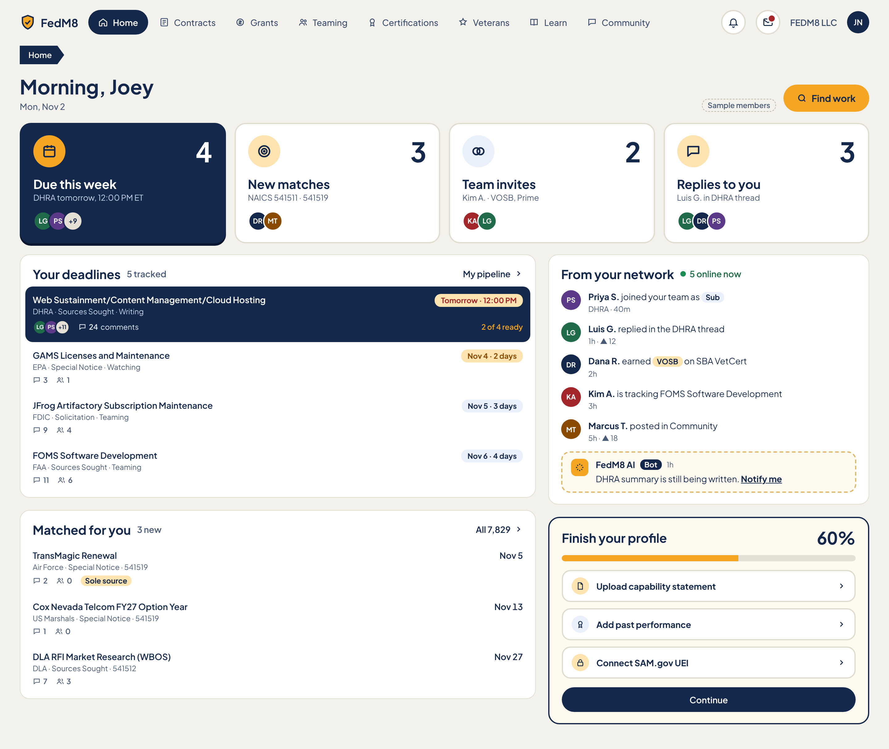
Eye path (after rules)
- 1 H1 greeting 'Morning, Joey' with date, Find work amber button top-right
- 2 Four StatCards: Due this week, New matches, Team invites, Replies to you (only big numbers on the app)
- 3 Your deadlines list (soonest first, DHRA row cream with red 'Tomorrow' chip, not navy)
- 4 Matched for you list
- 5 Right rail: From your network feed, FedM8 AI bot, Finish your profile (Continue is outline)
Change from the comp
- R2 Find work is the only amber button; Continue becomes outline
- R1 'Due this week' card and DHRA row no longer navy: StatCard light, DHRA row cream with red 'Tomorrow' chip
- R4 no breadcrumb on Home
- R5 apply urgency colours to every deadline chip and 'Nov 4 . 2 days' strings
- R6/R9 big numbers only on StatCards; hide numbers while loading
- R8 meta >= 13px
- Remove 'Sample members' chip for production
Modules (11)
- 0. App header and primary nav
AppHeader + PillNavheader- Logo, 8 NavPills with icons (Home active/navy, Contracts, Grants, Teaming, Certifications, Veterans, Learn, Community)
- Two IconButtons (search and notifications, icon-only)
- WorkspaceSwitcher 'FEDM8 LLC'
- Avatar 'JN'
- pill navigates
- notification button opens list with unread dot
- switcher and avatar open menus
- 1. Greeting and primary action
PageTitle + PrimaryButtonmain- H1 'Morning, Joey' (time-of-day aware)
- Date 'Mon, Nov 2'
- Find work amber button with search icon
- No breadcrumb (R4)
- Find work navigates to Find work hub
- greeting changes Morning/Afternoon/Evening
- 2. StatCard: Due this week
StatCardmain social- Number 4 (type-stat)
- Label 'Due this week'
- Sub 'DHRA tomorrow, 12:00 PM ET'
- AvatarStack LG PS +9
- Card styled light (was navy; navy removed per R1)
- click opens My pipeline filtered to due this week
- avatar stack opens roster drawer
- 3. StatCard: New matches
StatCardmain social- Number 3
- Label 'New matches'
- Sub 'NAICS 541511 . 541519'
- AvatarStack DR MT
- click scrolls/navigates to Matched for you
- 4. StatCard: Team invites
StatCardmain social- Number 2
- Label 'Team invites'
- Sub 'Kim A. . VOSB, Prime' with CertBadge text
- AvatarStack KA LG
- click opens Teaming invites
- 5. StatCard: Replies to you
StatCardmain social- Number 3
- Label 'Replies to you'
- Sub 'Luis G. in DHRA thread'
- AvatarStack LG DR PS
- click opens Messages/Community replies
- 6. Your deadlines
NoticeRow list + Section headermain social- Heading 'Your deadlines' and '5 tracked'
- 'My pipeline' link with arrow
- Row 1 DHRA Web Sustainment: Sources Sought . Writing stage, 'Tomorrow . 12:00 PM' red chip, AvatarStack LG PS +11, 24 comments, '2 of 4 ready' coverage
- Row 2 EPA GAMS: Special Notice . Watching, Nov 4 . 2 days, 3 comments, 1 team
- Row 3 FDIC JFrog: Solicitation . Teaming, Nov 5 . 3 days, 9/4
- Row 4 FAA FOMS: Sources Sought . Teaming, Nov 6 . 4 days, 11/6
- Soonest first; DHRA row cream with red chip, not navy
- row click opens contract detail
- My pipeline link opens pipeline
- urgency per R5
- 7. Matched for you
NoticeRow listmain social- Heading 'Matched for you' with '3 new' badge
- 'All 7,829' link with arrow
- TransMagic Renewal: Air Force . Special Notice . 541519, Nov 5, 2 comments, 0 teaming
- Cox Nevada Telcom FY27 Option Year: US Marshals . Special Notice . 541519, Nov 13, 1/0, 'Sole source' tag
- DLA RFI Market Research (WBOS): DLA . Sources Sought . 541512, Nov 27, 7/3
- row opens contract detail
- All 7,829 opens Contracts list
- Sole source tag is informational
- 8. From your network
ActivityFeedItem listright social- Heading 'From your network' with '5 online now' and PresenceDot
- Priya S. joined your team as Sub, DHRA . 40m (RoleBadge)
- Luis G. replied in the DHRA thread, 1h . up 12
- Dana R. earned VOSB on SBA VetCert, 2h (CertBadge)
- Kim A. is tracking FOMS Software Development, 3h
- Marcus T. posted in Community, 5h . up 18
- item opens its target (team, thread, profile, notice, post)
- avatar opens profile
- 9. FedM8 AI note
BotPostright- Bot avatar, 'FedM8 AI' Bot tag, 1h
- 'DHRA summary is still being written.' and Notify me link
- Notify me subscribes
- 10. Finish your profile
ProgressCard + Checklistright- Heading 'Finish your profile' with 60%
- Progress bar
- 3 checklist rows with chevron: Upload capability statement, Add past performance, Connect SAM.gov UEI
- Continue button (outline, was navy)
- row opens that step
- Continue goes to next incomplete step
- percent recalculates as steps complete
Features (10)
- Personalised greeting and date
- Find work shortcut
- 4 StatCards deep-linking to their lists
- Deadlines list from pipeline with stage, coverage, comments, team
- Matched-for-you notices by NAICS
- Network activity feed with presence
- FedM8 AI notification
- Profile completion checklist
- Urgency colours per R5
- Runtime theming
Acceptance checklist (22)
Responsive · accessibility · open questions
<=1024: right rail drops below main (network feed, AI note, profile progress stacked), StatCards 2x2. <=480: BottomTabBar, StatCards 2 columns compact then horizontal-scroll-free stack, Find work becomes full-width, deadline rows show title+chip only with meta on second line.
- Landmarks: header, nav Main, main, aside 'From your network'
- H1 is the greeting; section headings h2
- StatCards are links with full text label
- Progress bar role=progressbar with value
- Urgency has text, not colour alone
- Focus order follows eye path; tap targets >= 44px
- Do 'New matches' count since last visit or last 24h?
- Which events appear in the network feed and can users mute it?
- Is 'Replies to you' limited to threads the user posted in?
- Should the profile card disappear at 100%?
Find work hub
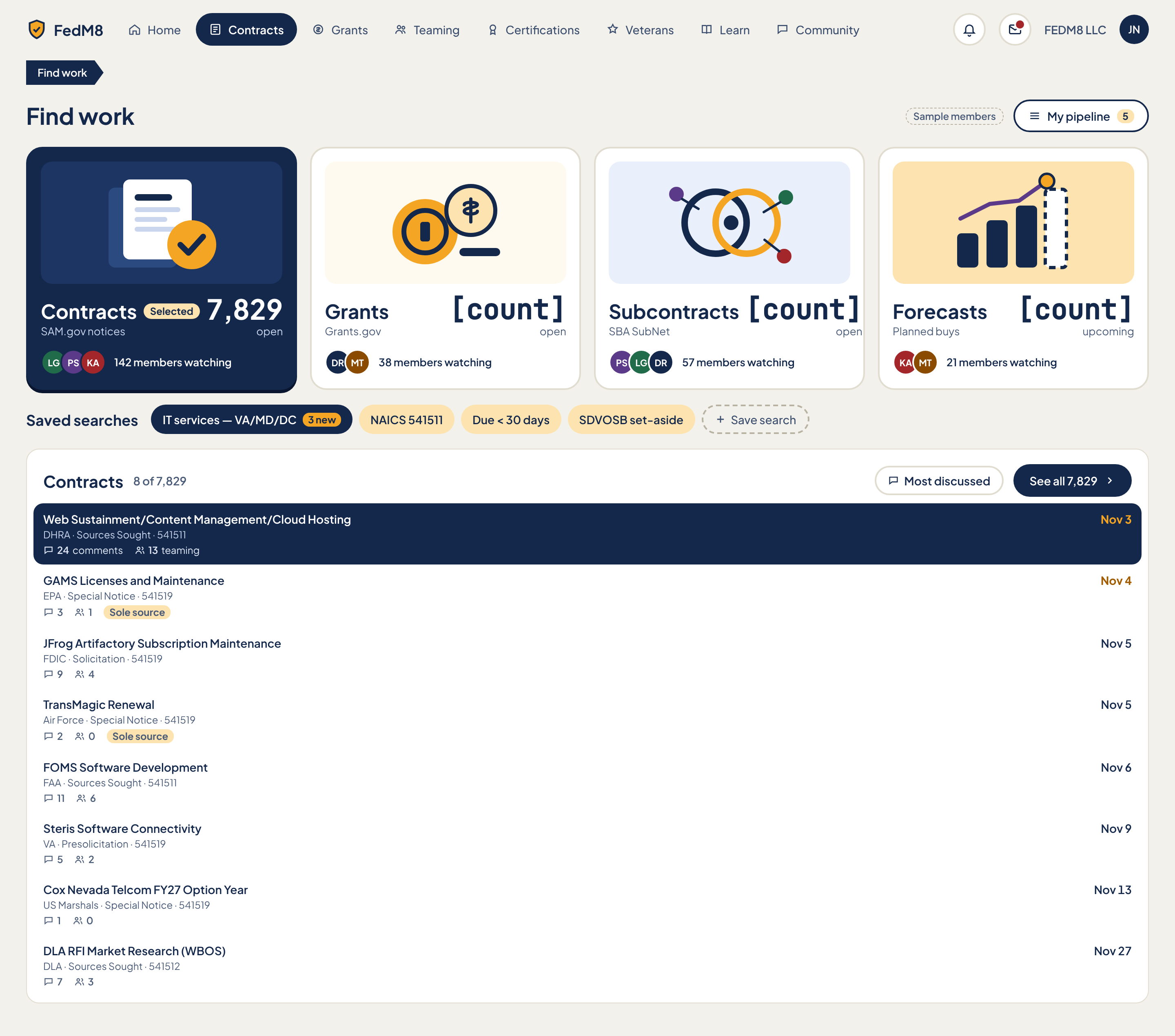
Eye path (after rules)
- 1 H1 'Find work' with My pipeline (5) top-right
- 2 Four picture ChoiceCards left to right: Contracts, Grants, Subcontracts, Forecasts (label first, count second)
- 3 Saved searches row: IT services chip with '3 new', filter chips, Save search
- 4 Contracts list '8 of 7,829' sorted Most discussed; See all
- Urgency colour on each row by days left
Change from the comp
- R9 '[count]' placeholders on Grants/Subcontracts/Forecasts replaced with real counts or hidden
- R4 single-segment breadcrumb dropped; page starts at H1
- R5 list rows coloured by days left
- R6 label first then count with unit word ('open', 'upcoming')
- R2 My pipeline is the one primary button
- R7 two-state chips
- Remove 'Sample members' chip for production
Modules (9)
- 0. App header and primary nav
AppHeader + PillNavheader- Logo, 8 NavPills (Contracts shown active in comp as Find work lives under Contracts)
- Two IconButtons
- WorkspaceSwitcher 'FEDM8 LLC'
- Avatar 'JN'
- pill navigates
- icons open search/notifications
- 1. Title and pipeline action
PageTitle + PrimaryButtonmain- H1 'Find work' (single-segment breadcrumb 'Find work' removed, R4)
- 'Sample members' chip (comp only)
- My pipeline button with icon and count 5
- My pipeline opens pipeline page
- count updates when tracking changes
- 2. Source card: Contracts
ChoiceCardmain social- Picture/icon, label 'Contracts', sub 'SAM.gov notices'
- Count '7,829 open' (count second, unit word)
- AvatarStack LG PS KA
- '142 members watching'
- Selected state (navy) because Contracts list is below
- click selects source and switches list below and chips
- keyboard Enter/Space
- arrow keys between cards
- 3. Source card: Grants
ChoiceCardmain social- Label 'Grants', sub 'Grants.gov'
- Count (comp '[count] open' placeholder, must be real or hidden)
- AvatarStack DR MT
- '38 members watching'
- click opens Grants list
- same keyboard behaviour
- 4. Source card: Subcontracts
ChoiceCardmain social- Label 'Subcontracts', sub 'SBA SubNet'
- Count '[count] open' placeholder
- AvatarStack PS LG DR
- '57 members watching'
- click opens Subcontracts list
- 5. Source card: Forecasts
ChoiceCardmain social- Label 'Forecasts', sub 'Planned buys'
- Count '[count] upcoming' placeholder
- AvatarStack KA MT
- '21 members watching'
- click opens Forecasts list
- 6. Saved searches
SavedSearchChip + FilterChip + TextButtonmain- Heading 'Saved searches'
- Saved search chip 'IT services - VA/MD/DC' with '3 new' badge
- Filter chips: NAICS 541511, Due < 30 days, SDVOSB set-aside
- Save search text button with icon
- saved chip applies its filters to the list
- filter chip toggles (two states, R7)
- Save search stores current filters and names it
- new badge clears after opening
- 7. List header
Section header + sortmain- Heading 'Contracts'
- Count '8 of 7,829'
- Sort control 'Most discussed'
- 'See all 7,829' link with arrow
- sort menu changes order
- See all opens full Contracts search
- 8. Contracts list
NoticeRow x8main social- DHRA Web Sustainment/Content Management/Cloud Hosting, Sources Sought, 541511, Nov 3, 24 comments, 13 teaming
- EPA GAMS Licenses and Maintenance, Special Notice, 541519, Nov 4, 3/1, Sole source tag
- FDIC JFrog Artifactory Subscription Maintenance, Solicitation, 541519, Nov 5, 9/4
- Air Force TransMagic Renewal, Special Notice, 541519, Nov 5, 2/0, Sole source tag
- FAA FOMS Software Development, Sources Sought, 541511, Nov 6, 11/6
- VA Steris Software Connectivity, Presolicitation, 541519, Nov 9, 5/2
- US Marshals Cox Nevada Telcom FY27 Option Year, Special Notice, 541519, Nov 13, 1/0
- DLA RFI Market Research (WBOS), Sources Sought, 541512, Nov 27, 7/3
- Each row: UrgencyChip by days left, comment icon+count, teaming icon+count
- row opens contract detail
- keyboard arrow navigation
- urgency colour R5
Features (10)
- Four source ChoiceCards with counts and watchers
- Switch list by source
- Saved searches with new-count badges
- Filter chips
- Save current search
- Most-discussed contract list with comment and teaming counts
- See all link
- My pipeline shortcut with count
- Urgency colours by days left
- Runtime theming
Acceptance checklist (22)
Responsive · accessibility · open questions
<=1024: source cards 2x2, saved searches scroll horizontally in a single row, list full width. <=480: source cards become a horizontal segmented picker or stacked compact cards (icon, label, count), BottomTabBar, row meta wraps below title, counts remain visible.
- Landmarks: header, nav Main, main
- Source cards are a radiogroup (aria-checked) or links with aria-current
- Saved search chips are buttons with aria-pressed
- List is ul with each row a single link
- Urgency not by colour alone
- Focus ring --fm-focus-ring, tap >= 44px
- Which pill is active on this hub, Contracts or a separate Find work item?
- Are Subcontracts and Forecasts data sources live in v1 or Coming soon?
- What counts as 'members watching' (tracking, following, or viewing)?
- Does Save search sync across devices and notify on new?
Grant detail
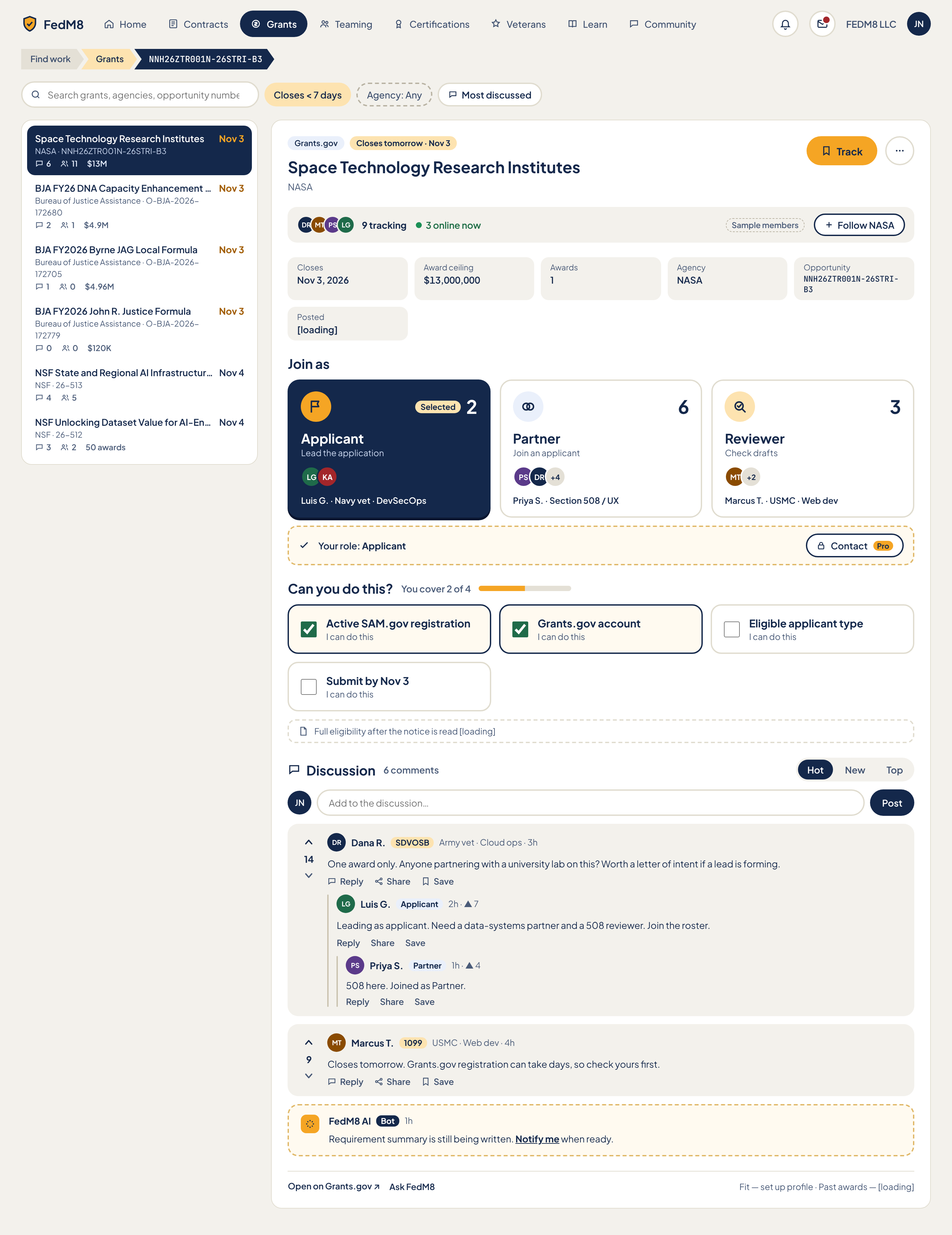
Eye path (after rules)
- 1 Title + CountdownBanner ('Closes tomorrow, Nov 3', urgent colour) with Track top-right
- 2 SummaryCard (BLUF) plus one FactLine (closes, ceiling, awards, agency, opportunity #, posted)
- 3 Can you do this? (eligibility toggles + coverage)
- 4 Join as Applicant / Partner / Reviewer then ClaimBar
- 5 Discussion with FedM8 AI bot post
- Left list of grants (selected row cream) and header tracking bar are supporting
Change from the comp
- R3 same reorder as contract detail: title+countdown, Summary, Can you do this?, Join as, Discussion
- R3 facts collapse to one FactLine
- List rows show only title, agency, ceiling, close date (opportunity number moved off row to stop 2-line wrap)
- R1 selected list row cream not navy
- R2 only Track is amber
- R5 urgency colours on countdown and rows (all Nov 3 rows urgent)
- R6 Join-as label first, count second
- R9 '[loading]' placeholders become skeletons or hidden
- Remove 'Sample members' chip for production
Modules (15)
- 0. App header and primary nav
AppHeader + PillNavheader- Logo, 8 NavPills with Grants active (navy)
- WorkspaceSwitcher 'FEDM8 LLC'
- Avatar 'JN'
- pill navigates
- switcher and avatar menus
- 1. Breadcrumb
ChevronBreadcrumbheader- Find work > Grants > NNH26ZTR001N-26STRI-B3 (depth 3)
- Last segment current
- Find work to hub, Grants to grants list
- 2. Search and filters
SearchField + FilterChipleft- SearchField 'Search grants'
- Chips: Closes < 7 days, Agency: Any
- Sort 'Most discussed'
- typing filters list
- chip toggles two states (R7)
- sort menu: Most discussed, Closing soonest, Largest ceiling
- 3. Grant list
NoticeRow x6left social- Row shows only: title, agency (opportunity number moved off the row, no 2-line wrap), ceiling, close date, urgency
- NASA Space Technology Research Institutes, Nov 3, $13M, comments 6, partners 11
- Bureau of Justice Assistance BJA FY26 DNA Capacity Enhancement for Backlog Reduction (CEBR), Nov 3, $4.9M, 2/1
- BJA FY2026 Byrne JAG Local Formula, Nov 3, $4.96M, 1/0
- BJA FY2026 John R. Justice Formula, Nov 3, $120K, 0/0
- NSF State and Regional AI Infrastructure Hubs (26-513), Nov 4, 4/5
- NSF Unlocking Dataset Value for AI-Enabled Scientific Discovery (26-512), Nov 4, 3/2
- Selected row cream + bold title (R1)
- Footer '50 awards' text in comp is unlabeled; treat as list count note (see open questions)
- row click opens detail
- arrow-key selection
- urgency colour R5
- 4. Detail header
PageTitle + TypeBadge + Track PrimaryButtonmain- Source badge 'Grants.gov'
- Title 'Space Technology Research Institutes'
- Agency 'NASA'
- Track amber top-right
- More actions IconButton
- Track adds to My pipeline and flips to Tracking
- More actions: copy link, share, mute
- 5. Countdown
CountdownBanner + UrgencyChipmain- Large 'Closes tomorrow, Nov 3' in --fm-urgent (replaces small chip 'Closes tomorrow . Nov 3')
- live update
- add to calendar text button
- 6. Tracking bar
TrackingBar + AvatarStack + FollowButtonmain social- AvatarStack DR MT PS LG
- '9 tracking', '3 online now' with PresenceDot
- Follow NASA button (outline)
- avatar stack opens roster
- Follow toggles Following
- 7. AI summary (BLUF)
SummaryCardmain Pro- BLUF of the notice
- Pending/ready/failed
- Comp state: 'Requirement summary is still being written' with Notify me when ready
- Pro tag
- Notify me subscribes
- Retry on failed
- 8. Fact line
FactLinemain- Closes Nov 3, 2026 . Award ceiling $13,000,000 . Awards 1 . Agency NASA . Opportunity NNH26ZTR001N-26STRI-B3 . Posted <date>
- Comp 'Posted [loading]' must be real date or omitted
- opportunity number copy on click
- 9. Can you do this?
RequirementToggle list + CoverageMetermain social- Meter 'You cover 2 of 4'
- Toggles: Active SAM.gov registration, Grants.gov account, Eligible applicant type, Submit by Nov 3 (each 'I can do this')
- Note 'Full eligibility after the notice is read' with loading state
- toggle updates meter and ClaimBar, persists
- aria-pressed
- 10. Join as
JoinAsPicker (3 ChoiceCards)main social- Applicant 'Lead the application' (2)
- Partner 'Join an applicant' (6)
- Reviewer 'Check drafts' (3)
- Label first, count second with unit word (R6)
- AvatarStack per role
- Names: Luis G. Navy vet . DevSecOps; Priya S. Section 508 / UX; Marcus T. USMC . Web dev
- Applicant selected (navy)
- click selects role, updates ClaimBar
- second click opens roster lane
- 11. Claim bar
ClaimBar + ProLockmain Pro social- 'Your role: Applicant'
- Contact button with Pro tag
- Contact opens composer if Pro, else upgrade drawer
- role label updates live
- 12. Discussion
ThreadList + Composer + SortTabs + ThreadPost + VoteRailmain social- 'Discussion' and '6 comments'
- Hot/New/Top
- Composer JN 'Add to the discussion' + Post
- Dana R. SDVOSB Army vet . Cloud ops . 3h, vote 14: 'One award only. Anyone partnering with a university lab...'
- Nested Luis G. Applicant 2h up 7; Priya S. Partner 1h up 4
- Marcus T. 1099 USMC . Web dev . 4h, vote 9: 'Closes tomorrow. Grants.gov registration can take days...'
- Reply/Share/Save, up/down vote
- sort
- vote once
- reply inline
- share
- save
- post
- 13. FedM8 AI bot post
BotPostmain social- FedM8 AI, Bot tag, 1h
- 'Requirement summary is still being written.' Notify me when ready
- Notify me subscribes
- replaced when summary ready
- 14. Source links and lookups
TextButton + FactLineright Pro- Open on Grants.gov external link
- Ask FedM8 button (Pro)
- Fit line 'set up profile'
- Past awards '[loading]'
- Grants.gov opens new tab
- Ask FedM8 opens AI drawer
- Fit prompts profile setup
- Past awards loads real or hides
Features (16)
- Select any grant from list and view detail
- Search grants and filter by close window and agency
- Live countdown with urgency colour
- Track into pipeline
- Follow agency
- Tracking and online counts
- AI BLUF summary states
- Eligibility toggles with coverage meter
- Join as Applicant, Partner or Reviewer
- Contact roster (Pro)
- Reddit-style discussion with votes, nesting, sort
- FedM8 AI bot post
- Open on Grants.gov, Ask FedM8, fit and past awards
- Award ceiling and awards count in fact line
- Chevron breadcrumb
- Runtime theming
Acceptance checklist (26)
Responsive · accessibility · open questions
<=1024: list becomes top drawer or 'Grants' toggle, detail full width, source links under Discussion. <=480: BottomTabBar, 3 segments Overview / Talk / Team, full-width amber Track, Join-as cards stacked, FAB with bottom padding.
- Landmarks: header, nav Main, main with regions 'Grant list', 'Grant detail', 'Requirements', 'Join as', 'Discussion'
- Breadcrumb nav aria-current on last
- Vote buttons labelled
- Urgency also text
- Focus order follows eye path; focus ring --fm-focus-ring; tap >= 44px
- What does the '50 awards' footer in the list refer to (total awards, result count)?
- Where does generic eligibility come from before the notice is parsed?
- Should the Reviewer role be restricted to verified members?
- Do closed grants stay discoverable and how are they labelled?
My pipeline
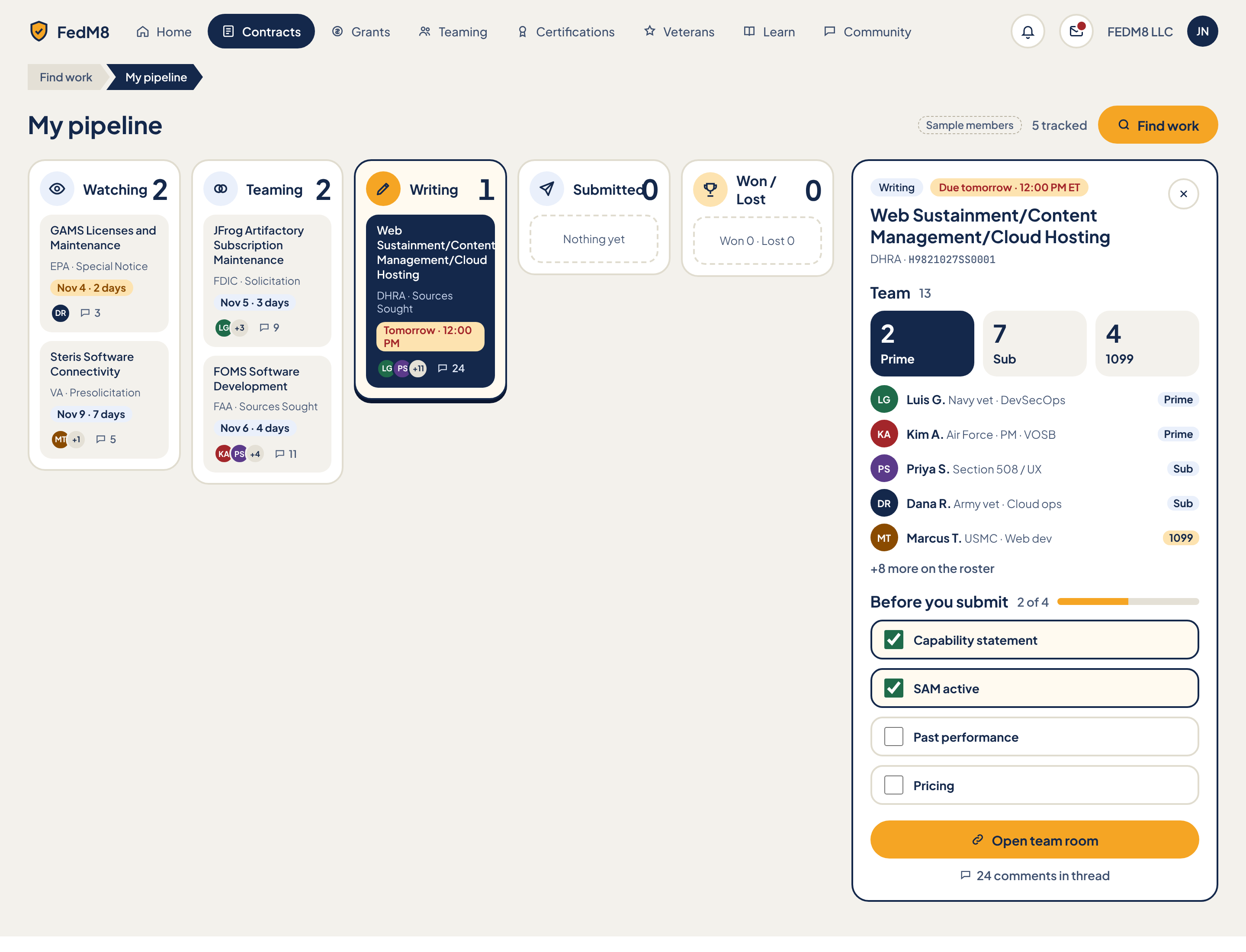
Eye path (after rules)
- 1 H1 'My pipeline' + '5 tracked' count (no breadcrumb duplication of the nav pill; breadcrumb stays only because depth is 2: Find work > My pipeline per R4)
- 2 Stage columns left to right: Watching, Teaming, Writing, Submitted, Won / Lost; column header is icon + label first, count second (R6 applied to stage headers; count is 18px muted, not 32px)
- 3 Most urgent card is visually first: urgency chip (R5) in red when <=48h, amber <=7d, neutral later
- 4 Selected card = cream tint + bold title (R1), never navy
- 5 Drawer overlays the board from the right and shows: title + countdown, Team, Before you submit
- 6 One amber action: Open team room (top-right of drawer focus area). Find work becomes outline while the drawer is open
- 7 Secondary: comment-thread link as text button
Change from the comp
- R1: selected card is cream tint (--fm-row-selected-bg) with bold title; remove navy card fill, navy column border and hard shadow on the Writing column; Prime role card in drawer is not navy-filled
- R2: only 'Open team room' is amber when the drawer is open; 'Find work' drops to outline in that state
- R4: breadcrumb kept (depth 2) but current segment not navy
- R5: Nov 4 (2 days) shows red or amber by computed hours; Nov 5/6/9 show amber (<=7 days); the comp's blue chips are removed; 'Tomorrow' red text chip
- R6: stage header label first, count second at 18px muted (comp 32px count is removed); drawer role cards label first (22px) count second with unit word ('7 subs')
- R7: stage chip in drawer is outline; no navy chips
- R8: card meta (agency, type, comment count) 13px minimum (comp 12px); avatar overflow initials stay decorative
- R9: Submitted 0 and Won/Lost 0 columns show text 'Nothing yet' / 'Won 0 · Lost 0', no big zero numerals
- Page note: wider stage columns, titles clamp to 2 lines (comp wrapped to 4), headers 'Submitted0' and 'Won / Lost' must not collide or wrap
- Page note: drawer overlays the board instead of consuming 35% width
- Remove SampleChip before ship; show sample data only through an in-app sample flag
- Drawer (comp) shows a 'Prime' role card in navy; replace with neutral cards since role is read-only here
Modules (12)
- 1. App header
AppHeaderheader- FedM8 logo link
- PillNav with 8 NavPills: Home, Contracts, Grants, Teaming, Certifications, Veterans, Learn, Community (Veterans, Learn, Community always visible per owner decision)
- Contracts pill is active (aria-current=page, --fm-nav-active-bg)
- Notifications IconButton
- Messages IconButton with unread dot (red)
- WorkspaceSwitcher label 'FEDM8 LLC'
- Avatar initials JN
- click NavPill navigates to that section
- click Notifications opens notifications panel
- click Messages goes to /os#/messages
- click WorkspaceSwitcher opens workspace list
- click Avatar opens account menu incl. ThemeSwitcher link
- 2. Breadcrumb
ChevronBreadcrumbheader- Segment 'Find work' (link, neutral fill)
- Segment 'My pipeline' (current, aria-current=page)
- click 'Find work' goes to the Find work hub
- 3. Page title row
PageTitleheader- H1 'My pipeline'
- SampleChip 'Sample members' (comp-only, must not ship)
- '5 tracked' count text
- Find work PrimaryButton with search icon (comp) -> becomes SecondaryButton when drawer is open or a card is selected
- click Find work goes to Contracts hub
- 4. Stage column: Watching
KanbanColumnmain social- Icon eye in --fm-info-soft circle
- Label 'Watching'
- Count (comp 2)
- KanbanCard: GAMS Licenses and Maintenance / EPA · Special Notice / UrgencyChip 'Nov 4 · 2 days' / AvatarStack (DR) / comment count 3
- KanbanCard: Steris Software Connectivity / VA · Presolicitation / UrgencyChip 'Nov 9 · 7 days' / AvatarStack (MT, +1) / comment count 5
- click card selects it and opens the drawer
- drag card to another stage changes its stage
- keyboard: card focusable, Enter opens drawer, 'Move to' menu on card as drag alternative
- Card titles clamp to 2 lines with full title in tooltip
- 5. Stage column: Teaming
KanbanColumnmain social- Icon two-circles in --fm-info-soft circle
- Label 'Teaming'
- Count (comp 2)
- KanbanCard: JFrog Artifactory Subscription Maintenance / FDIC · Solicitation / chip 'Nov 5 · 3 days' / AvatarStack (LG, +3) / comments 9
- KanbanCard: FOMS Software Development / FAA · Sources Sought / chip 'Nov 6 · 4 days' / AvatarStack (KA, PS, +4) / comments 11
- same as Watching: select, drag, Move-to menu
- 6. Stage column: Writing
KanbanColumnmain social- Icon pencil in --fm-action circle
- Label 'Writing'
- Count (comp 1)
- KanbanCard (selected in comp): Web Sustainment/Content Management/Cloud Hosting / DHRA · Sources Sought / UrgencyChip 'Tomorrow · 12:00 PM' in red text chip (<=48h) / AvatarStack (LG, PS, +11) / comments 24
- select/drag/move as other columns
- Column highlight (comp used navy border + hard shadow) is removed; selection shows on the card only (R1)
- 7. Stage column: Submitted
KanbanColumnmain- Icon paper-plane in --fm-info-soft circle
- Label 'Submitted'
- Count 0
- Dashed EmptyState 'Nothing yet'
- drop target for cards moved from Writing; dropping asks 'Mark as submitted?' confirm
- 8. Stage column: Won / Lost
KanbanColumnmain- Icon trophy in --fm-accent-soft circle
- Label 'Won / Lost' (must not wrap; use 'Results' short label at narrow widths)
- Count 0
- Dashed EmptyState 'Won 0 · Lost 0'
- dropping a card asks Won or Lost via SegmentedControl in a small popover
- 9. Bid drawer header
Drawerdrawer- Stage chip 'Writing' (FilterChip style, unselected outline)
- UrgencyChip 'Due tomorrow · 12:00 PM ET' (red, <=48h)
- H2 notice title
- Agency + solicitation number in mono 'DHRA · H9821027SS0001'
- Close IconButton (X)
- Overlay: drawer sits over the board, ~420px wide, does not shrink columns
- Esc or X closes and returns focus to the originating card
- click title opens Contract detail
- click outside does not close (board stays usable)
- 10. Team (drawer)
RosterListdrawer Pro social- H3 'Team' + count 13
- 3 ChoiceCards: Prime 2, Sub 7, 1099 4 (label first, count second with unit, R6; Prime is the user's role = selected navy only if it is a choice; here it is read-only so use neutral cards with the user's role marked by a 'You' badge)
- 5 roster rows: Avatar, name, descriptor, RoleBadge (Luis G. Navy vet DevSecOps Prime; Kim A. Air Force PM VOSB Prime; Priya S. Section 508/UX Sub; Dana R. Army vet Cloud ops Sub; Marcus T. USMC Web dev 1099)
- '+8 more on the roster' TextButton
- click role card filters roster to that role
- click member row opens Member profile
- contact actions on a member are ProLock-gated
- click '+8 more' expands the roster or opens the team room roster
- 11. Before you submit
Checklistdrawer- H3 'Before you submit'
- Progress text '2 of 4' + progress bar (amber fill 50%)
- 4 checkbox rows: Capability statement (checked), SAM active (checked), Past performance (unchecked), Pricing (unchecked)
- Checked rows use --fm-success-soft, not navy border
- toggle a checkbox updates progress text and bar
- SAM active auto-checks from the workspace SAM registration status and cannot be unchecked by hand
- keyboard: Space toggles
- 12. Drawer actions
PrimaryButtondrawer social- PrimaryButton 'Open team room' with link icon (the single amber button on the page when drawer is open)
- TextButton '24 comments in thread' with comment icon
- Open team room goes to /os#/messages with the notice room selected
- comments link opens the notice Discussion on Contract detail
Features (15)
- Five-stage board: Watching, Teaming, Writing, Submitted, Won / Lost
- Tracked-count in page title
- Notice cards with title (2-line clamp), agency, notice type, urgency chip, team avatar stack, comment count
- Graded urgency colour on cards and drawer (R5)
- Select card to open overlay drawer; Esc closes
- Drag card between stages plus keyboard Move-to menu
- Empty-stage dashed placeholders
- Drawer: stage chip, countdown, title, agency, solicitation number
- Drawer team summary by role (Prime/Sub/1099) with roster rows and +N more
- Pro-gated member contact
- Before-you-submit checklist with progress
- Open team room primary action
- Comment thread link
- Find work shortcut
- Header: nav, notifications, messages unread dot, workspace switcher, avatar
Acceptance checklist (25)
Responsive · accessibility · open questions
<=1024: columns become horizontally scrollable lanes with scroll-snap (min column width 240px) or a stage SegmentedControl showing one column at a time; drawer becomes a right sheet 100% wide up to 480px. <=480: single-stage view with Tabs for the five stages (counts in tab label), drawer becomes a full-screen bottom sheet, 'Open team room' becomes sticky bottom button, BottomTabBar replaces PillNav, no horizontal page scroll.
- Landmarks: header (banner), nav aria-label Main, main with section aria-label Stages, aside/dialog for drawer
- Each column is a list with aria-label '<Stage>, N items'
- Cards are links/buttons with accessible name 'title, agency, due date, N comments'
- Drawer is role=dialog non-modal, aria-labelledby the H2; focus moves to the drawer heading on open and returns on close
- Drag has a keyboard equivalent and a live-region announcement on move
- Checklist uses native checkboxes with visible labels; progress bar has role=progressbar with aria-valuenow
- Colour is never the only urgency signal: chip text contains the time ('Tomorrow', '2 days')
- Focus ring uses --fm-focus-ring on all interactive items
- Are stage changes manual only, or do some auto-advance (e.g. Writing to Submitted when a SAM award notice appears)?
- Does 'Teaming' stage mean the user has a team, or is looking for one? Define entry criteria
- Can a user track a notice without any team room existing yet (what does Open team room do)?
- Where does a Grant appear: same board or a separate pipeline? Comp only shows contracts
- Is the Before you submit checklist per notice or per workspace for items like Capability statement and SAM active?
- Won/Lost: how is outcome recorded (manual vs award data)?
Teaming network
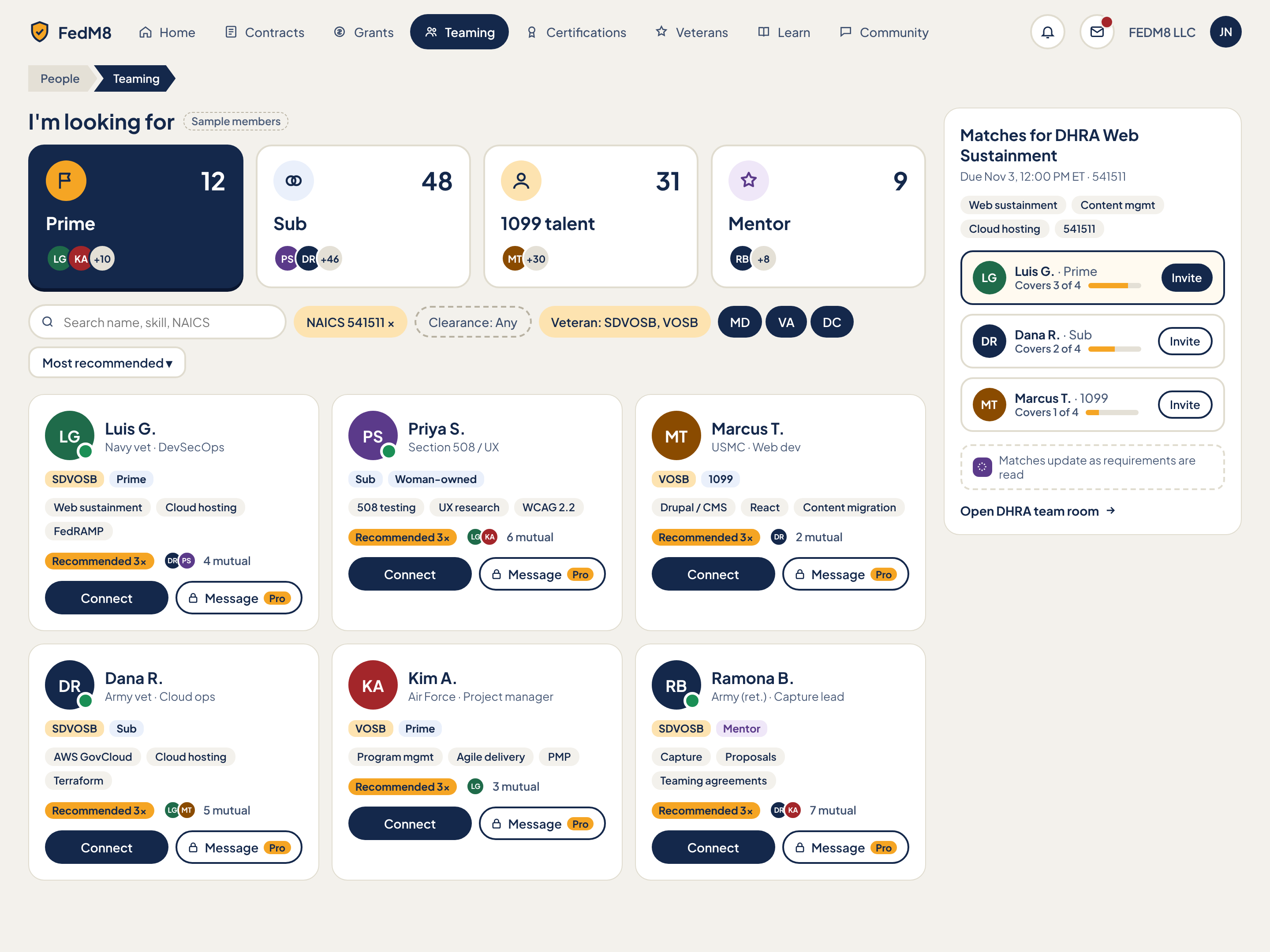
Eye path (after rules)
- 1 H1 'Teaming' (R4: the comp's People > Teaming breadcrumb is removed, depth 1)
- 2 'I'm looking for' ChoiceCards: label first (Prime / Sub / 1099 talent / Mentor), count second with unit word (R6); selected card navy (R1 allowed here: it is a selected choice card)
- 3 Matches rail for the due-soonest bid: heading + countdown, requirement chips, ranked members with coverage meter; one amber Invite on the top match (R2)
- 4 Filter row: search + FilterChips (two states only, R7) + sort
- 5 Member grid: name, role/cert badges, skills, mutual connections; 'Recommended N×' only on cards where it stands out
- 6 Card actions: Connect (outline), Message (ProLock for free plan)
Change from the comp
- R4: remove People > Teaming breadcrumb; page starts with H1 'Teaming'
- R1: top match row cream tint (--fm-row-selected-bg) instead of navy outline; only the selected 'I'm looking for' choice card stays navy
- R2: one amber primary: Invite on the top match in the rail (top-right of the focus area). Connect buttons on cards become outline; Message stays outline with Pro tag
- R6: ChoiceCard counts move from 28px top-right to second line 18px muted with unit word ('12 primes'); label stays 22px first
- R7: unify filter chips to two states (selected amber-soft, unselected outline); State chips MD/VA/DC no longer navy-filled; 'Clearance: Any' dashed chip becomes outline
- R8: skill chips and badges at least 13px (comp 12px); 'N mutual' stays 13px
- R9: no unknown counts shown as large numbers; hide role counts while loading
- Page note: show 'Recommended' badge only when it stands out (N >= 2 and above grid median); not on every card
- Page note: on small screens the Matches rail moves above the member grid
- Remove SampleChip before ship
- Message button shows lock icon + Pro tag as ProLock; Veterans get 3 months Pro so lock should read 'Free for 3 months' where trial is available
Modules (10)
- 1. App header
AppHeaderheader- FedM8 logo
- PillNav: Home, Contracts, Grants, Teaming (active), Certifications, Veterans, Learn, Community
- Notifications IconButton
- Messages IconButton with unread dot
- WorkspaceSwitcher 'FEDM8 LLC'
- Avatar JN
- nav click navigates
- Avatar opens account menu with ThemeSwitcher
- 2. Page title
PageTitleheader- H1 'Teaming' (new in v2; comp had breadcrumb 'People > Teaming' instead)
- SampleChip 'Sample members' (comp-only, must not ship)
- none
- 3. I'm looking for
ChoiceCardmain social- Section H2 "I'm looking for"
- 4 ChoiceCards in a group: Prime (icon flag, count 12), Sub (icon two circles, 48), 1099 talent (icon person, 31), Mentor (icon star in --fm-pro-soft, 9)
- Each: icon circle, label (type-xl) first, count with unit word second ('12 primes'), AvatarStack of 2 plus overflow (+10, +46, +30, +8)
- Prime selected by default in comp (navy fill, amber icon circle)
- click selects one card (single select) and filters the member grid and re-ranks matches
- click selected card again does not deselect (always one role)
- Mentor choice swaps card badges to mentor fields (area, availability)
- keyboard: arrow keys move within the radio-style group
- 4. Search and filters
FilterChipmain- SearchField 'Search name, skill, NAICS'
- FilterChip 'NAICS 541511 ×' (selected, removable)
- FilterChip 'Clearance: Any' (unselected, was dashed in comp)
- FilterChip 'Veteran: SDVOSB, VOSB' (selected)
- State group MD / VA / DC (3 toggle chips, all selected in comp; selected = --fm-chip-selected-bg, never navy)
- Sort dropdown 'Most recommended' (SegmentedControl/menu: Most recommended, Most mutual, Recently active, Name)
- typing filters grid (debounced 250ms)
- click chip toggles selected/unselected
- × on a chip removes it
- click unselected 'Clearance' opens option list
- sort change re-orders grid
- filters persist per user as a SavedSearchChip option (not shown in comp)
- 5. Member grid
RosterListmain Pro social- Responsive grid (min card 280px), 6 member cards in comp: Luis G. (Navy vet DevSecOps, SDVOSB, Prime), Priya S. (Section 508/UX, Woman-owned, Sub), Marcus T. (USMC Web dev, VOSB, 1099), Dana R. (Army vet Cloud ops, SDVOSB, Sub), Kim A. (Air Force Project manager, VOSB, Prime), Ramona B. (Army ret. Capture lead, SDVOSB, Mentor)
- Each card: Avatar 56px with PresenceDot (green when online; absent for Marcus and Kim), name link (type-lg), descriptor line 13px, CertBadge + RoleBadge (Mentor badge in --fm-pro-soft), 3 skill chips, 'Recommended 3×' badge, mutual-connections AvatarStack + 'N mutual' (4, 6, 2, 5, 3, 7), Connect button, Message button with Pro tag + lock icon
- click name opens Member profile
- Connect sends a connection request (button becomes 'Requested' text state, then 'Connected')
- Message: Pro users open DM, free users see ProLock with trial prompt
- click mutual stack opens list of mutual connections
- click skill chip adds it to the search filter
- infinite scroll or Load more, 24 per page
- 6. Recommended badge
ReactionChipmain social- 'Recommended N×' badge on member card, comp shows 3× on every card
- click shows who recommended (AvatarStack popover)
- 7. Matches rail header
SummaryCardright- H2 'Matches for DHRA Web Sustainment'
- Countdown line 'Due Nov 3, 12:00 PM ET · 541511' with red UrgencyChip (<=48h)
- Requirement chips: Web sustainment, Content mgmt, Cloud hosting, 541511
- click title opens Contract detail
- bid selector (change which tracked bid drives matches) opens a list of tracked notices
- 8. Ranked matches
CoverageMeterright social- 3 match rows: Luis G. Prime Covers 3 of 4 (75% bar) with amber Invite (primary); Dana R. Sub Covers 2 of 4 (50%) outline Invite; Marcus T. 1099 Covers 1 of 4 (25%) outline Invite
- Avatar 38px, name + role, CoverageMeter text 'Covers N of 4' at 13px
- Top match row uses cream tint (R1), not navy border
- Invite sends team invite to that member for this bid (button becomes 'Invited')
- click row opens Member profile
- ranking re-computes when requirements are read
- 9. Live-update note
EmptyStateright- Dashed note with AI icon (in --fm-pro): 'Matches update as requirements are read'
- none; becomes a spinner row while requirements are being read
- 10. Open team room link
TextButtonright social- TextButton 'Open DHRA team room' with arrow icon
- goes to Messages with the DHRA room selected
Features (12)
- Choose who you are looking for: Prime, Sub, 1099 talent, Mentor with counts and avatar stacks
- Search members by name, skill, NAICS
- Filter by NAICS, clearance, veteran/cert status, state (MD/VA/DC)
- Sort members (Most recommended, etc.)
- Member cards with online presence, cert and role badges, skills, mutual connections, recommendation count
- Connect and Message (Message gated by Pro)
- Matches rail for the due-soonest tracked bid with requirement chips
- Coverage meter 'Covers N of 4' per match
- Invite match to the bid
- Live-update note while requirements are read
- Open team room link
- Header nav, notifications, messages dot, workspace switcher
Acceptance checklist (25)
Responsive · accessibility · open questions
<=1024: single column; order is H1, Matches rail (collapsible card with top 3), ChoiceCards (2x2 grid), filters (chips horizontally scroll), member grid 2 columns. <=480: ChoiceCards 2x2 compact, filters behind a 'Filters' IconButton opening a sheet, member grid 1 column, Connect full width with Message as icon button, BottomTabBar replaces PillNav.
- Landmarks: banner, nav Main, main, aside aria-label Matches
- 'I'm looking for' is a radiogroup (role=radiogroup) with arrow-key navigation, or aria-pressed buttons with only one pressed
- Search input has a visually hidden label; chips are toggle buttons with aria-pressed; removable chips announce 'Remove NAICS 541511'
- Avatar stacks have role=img with a text label listing names and overflow count
- PresenceDot has accessible text 'Online'
- CoverageMeter has text 'Covers 3 of 4' plus aria-valuenow
- Disabled/locked Message button is focusable and explains why (aria-describedby)
- Focus order: search, chips, sort, grid cards, then rail (or rail first when it is reordered on small screens, matching visual order)
- What does 'Recommended N×' mean exactly (N recommenders, or N matches to my past bids)?
- Is the '4' in 'Covers N of 4' always 4, or the real requirement count for the bid? Comp always shows 4
- Which bid drives the Matches rail by default (due soonest tracked, or last opened)?
- Do role counts reflect the entire network or only the filtered state set?
- Mentor cards: which fields replace skills (areas, availability, free vs paid)?
- Clearance filter value set is undefined
Member profile
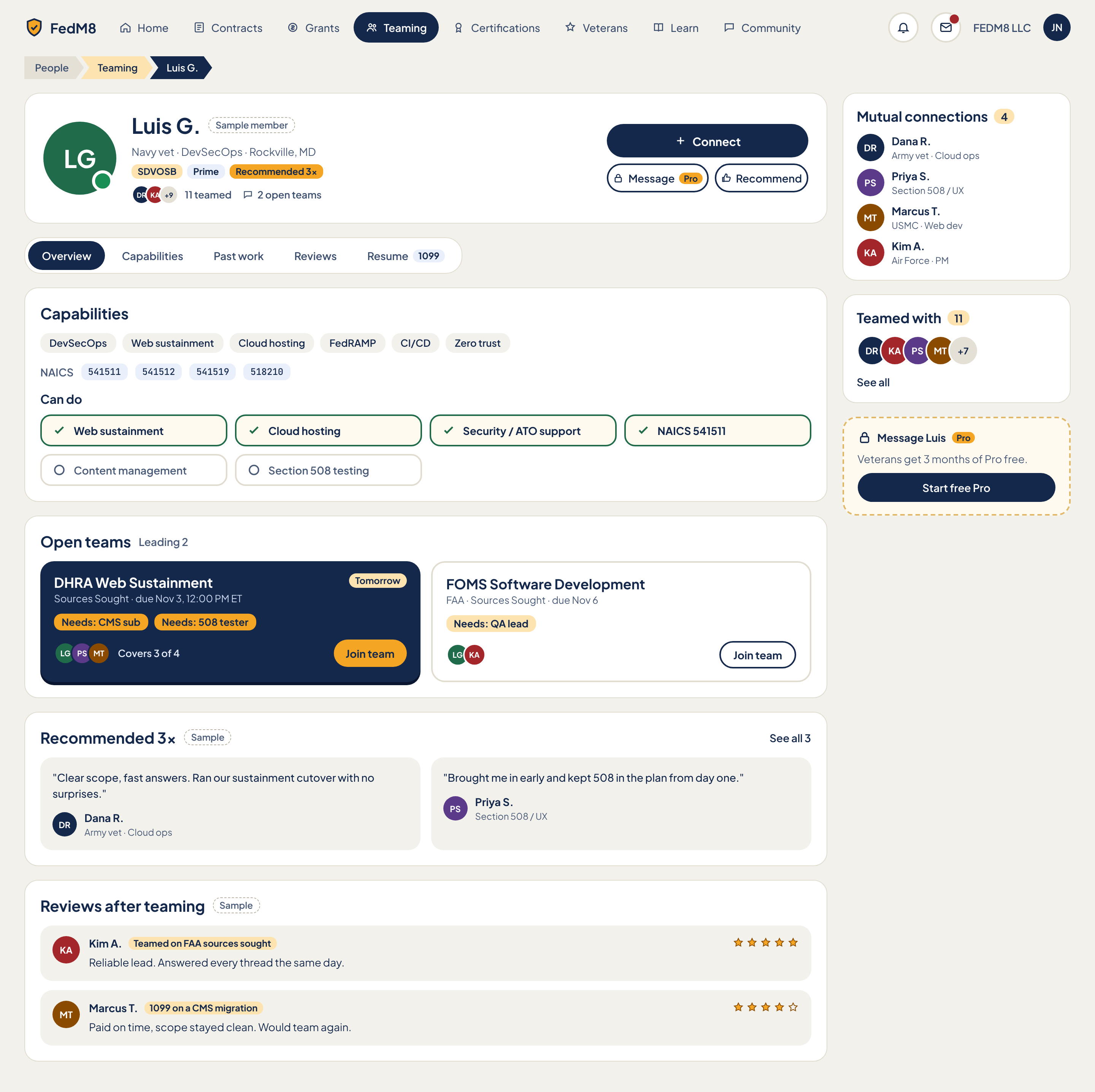
Eye path (after rules)
- 1 ChevronBreadcrumb People > Teaming > member (depth 3, R4 applies)
- 2 Profile header: Avatar + name + one line (service, specialty, location) + badges; Connect is the one amber button at top-right (R2)
- 3 Tabs: Overview, Capabilities, Past work, Reviews, Resume (1099)
- 4 Capabilities with Can-do grid (green check = confirmed)
- 5 Open teams to join: outline cards; 'Join team' as TextButton, no navy card (R1)
- 6 Recommendations, then Reviews after teaming
- 7 Right rail: Mutual connections, Teamed with, Pro unlock to message
Change from the comp
- Page note: Connect becomes the amber PrimaryButton (top-right of header card); Message and Recommend are outline
- Page note/R1: open-team cards are both outline; the DHRA card is no longer navy-filled; 'Join team' is a TextButton (comp had amber on one card, outline on the other)
- R2: 'Start free Pro' in the rail is outline so Connect is the only amber button
- R4: breadcrumb kept (depth 3); current segment not navy-filled
- R5: 'Tomorrow' chip on DHRA card uses --fm-urgent; FOMS due Nov 6 uses --fm-warn
- R7: no navy chips; the '1099' badge in the Resume tab is outline
- R8: descriptor lines, need chips, quote attribution at least 13px (comp 12px)
- R9: counts 11, 4, 3 are only shown when real; hide while loading
- Remove SampleChips ('Sample member', 'Sample') before ship
- Selected tab keeps navy pill (where you are within page) but tab bar is the only navy element in main content
Modules (11)
- 1. App header
AppHeaderheader- FedM8 logo
- PillNav 8 pills; Teaming active
- Notifications IconButton
- Messages IconButton with unread dot
- WorkspaceSwitcher 'FEDM8 LLC'
- Avatar JN
- nav click navigates
- avatar opens menu
- 2. Breadcrumb
ChevronBreadcrumbheader- Segment 'People' (neutral)
- Segment 'Teaming' (accent-soft, link)
- Segment 'Luis G.' (current, aria-current=page)
- click People goes to People hub; click Teaming goes back to Teaming with previous filters restored
- 3. Profile header
Avatarmain Pro social- Avatar 96px with 'Online now' PresenceDot
- H1 name 'Luis G.'
- SampleChip 'Sample member' (comp-only, must not ship)
- Subline 'Navy vet · DevSecOps · Rockville, MD'
- Badges: CertBadge SDVOSB, RoleBadge Prime, 'Recommended 3×' badge
- Stats line: AvatarStack (DR, KA, +9) '11 teamed', comment icon '2 open teams'
- Connect PrimaryButton (plus icon)
- Message SecondaryButton with lock icon + Pro tag
- Recommend SecondaryButton with thumbs-up icon
- Connect sends request; becomes 'Requested' then 'Connected'
- Message: Pro opens DM; free shows ProLock
- Recommend opens a short form (optional note, role worked together) and increments Recommended N× after submit; only available to members who teamed with this person
- click '11 teamed' scrolls to Teamed with rail card
- click '2 open teams' scrolls to Open teams
- 4. Profile tabs
Tabsmain- 5 tabs: Overview (selected), Capabilities, Past work, Reviews, Resume with '1099' RoleBadge
- Selected tab navy pill in comp
- click tab shows that section; Overview shows all sections stacked as in comp; Capabilities, Past work, Reviews, Resume each focus one section
- arrow keys move between tabs
- Resume tab visible only when member is available for 1099 work
- 5. Capabilities
Checklistmain- H2 'Capabilities'
- 6 skill chips: DevSecOps, Web sustainment, Cloud hosting, FedRAMP, CI/CD, Zero trust
- NAICS row (mono): 541511, 541512, 541519, 518210
- H3 'Can do' grid: confirmed (green check, success border) Web sustainment, Cloud hosting, Security / ATO support, NAICS 541511; unconfirmed (outline circle, muted) Content management, Section 508 testing
- click a skill chip filters Teaming by that skill
- click a NAICS code opens Find work filtered by that code
- 'Can do' items that match the viewer's tracked bid requirements are highlighted with a 'Matches DHRA' tag
- 6. Open teams
SquadCardmain social- H2 'Open teams' + 'Leading 2' text
- Card 1: DHRA Web Sustainment / 'Sources Sought · due Nov 3, 12:00 PM ET' / red UrgencyChip 'Tomorrow' / need chips 'Needs: CMS sub', 'Needs: 508 tester' / AvatarStack (LG, PS, MT) / 'Covers 3 of 4' / Join team
- Card 2: FOMS Software Development / 'FAA · Sources Sought · due Nov 6' / need chip 'Needs: QA lead' / AvatarStack (LG, KA) / Join team
- Comp card 1 is navy with amber Join team; v2 makes both cards outline and Join team a TextButton
- click card title opens the Contract detail
- Join team opens JoinAsPicker (Prime/Sub/1099) preselected to the needed role, then adds user to the team room
- need chips filter nothing; they link to the requirement on Contract detail
- 7. Recommendations
WinCardmain social- H2 'Recommended 3×'
- SampleChip 'Sample' (comp-only)
- TextButton 'See all 3'
- 2 quote cards: Dana R. 'Clear scope, fast answers. Ran our sustainment cutover with no surprises.'; Priya S. 'Brought me in early and kept 508 in the plan from day one.' each with Avatar, name, descriptor
- click author opens their profile
- See all 3 expands to all recommendations
- 8. Reviews after teaming
ThreadPostmain social- H2 'Reviews after teaming'
- SampleChip 'Sample'
- 2 review cards: Kim A. with chip 'Teamed on FAA sources sought', 5 of 5 stars, 'Reliable lead. Answered every thread the same day.'; Marcus T. with chip '1099 on a CMS migration', 4 of 5 stars, 'Paid on time, scope stayed clean. Would team again.'
- Stars have accessible text '5 out of 5 stars'
- reviews can only be written by members who teamed with this person (button 'Write a review' on tab view)
- report review action in overflow menu
- 9. Mutual connections
AvatarStackright social- H2 'Mutual connections' + count 4
- 4 rows: Dana R. Army vet · Cloud ops; Priya S. Section 508 / UX; Marcus T. USMC · Web dev; Kim A. Air Force · PM (avatar, name link, descriptor 13px)
- click name opens that profile
- 10. Teamed with
AvatarStackright social- H2 'Teamed with' + count 11
- AvatarStack 40px: DR, KA, PS, MT, +7
- TextButton 'See all'
- click avatar opens profile
- See all opens full list drawer
- 11. Message Luis (Pro unlock)
ProLockright Pro- Dashed accent card with lock icon, 'Message Luis' + Pro tag
- Copy 'Veterans get 3 months of Pro free.'
- Button 'Start free Pro' (navy in comp; v2 outline since Connect is the amber primary)
- Start free Pro activates the veteran trial or opens plan page for non-veterans
- card hides for Pro users
Features (12)
- Profile identity: avatar, presence, name, service/specialty/location, badges
- Connect (primary), Message (Pro), Recommend actions
- Teamed count and open-teams count shortcuts
- Tabs: Overview, Capabilities, Past work, Reviews, Resume (1099)
- Skills, NAICS codes, confirmed vs unconfirmed Can-do grid
- Open teams the member leads with needs and coverage; Join team
- Recommendations quotes with See all
- Reviews after teaming with star ratings and context chips
- Mutual connections list
- Teamed with avatar stack and See all
- Pro unlock card with veteran 3-month trial
- Breadcrumb People > Teaming > member
Acceptance checklist (25)
Responsive · accessibility · open questions
<=1024: right rail drops below main; header card stacks (avatar above text, actions full width in a row); tabs scroll horizontally. <=480: header actions become Connect full-width plus Message and Recommend as icon buttons; Open teams and Recommendations are single column; Capabilities Can-do grid single column; BottomTabBar replaces PillNav.
- Landmarks: banner, nav Main, nav Breadcrumb, main, aside aria-label Network
- H1 is the member name; sections use H2; Can-do uses H3
- Tabs follow the WAI-ARIA tabs pattern (tablist, tab, tabpanel, arrow keys)
- Star ratings use role=img with text '4 out of 5 stars'
- Avatar stacks expose names via aria-label
- Confirmed vs unconfirmed Can-do conveyed by text/icon not colour alone (add visually hidden 'Confirmed' / 'Not confirmed')
- Locked Message button remains focusable and describes the lock
- How is a Can-do item 'confirmed' (self-claim, past performance record, peer confirmation)?
- Who can write reviews and recommendations, and are reviews moderated?
- What do Overview vs the other tabs each show? Comp shows all sections stacked under Overview
- Is location (Rockville, MD) visible to everyone or only connections?
- What are the contents of Past work and Resume tabs (not designed)?
- Does 'Recommended 3×' count unique recommenders or endorsements?
Messages and team rooms
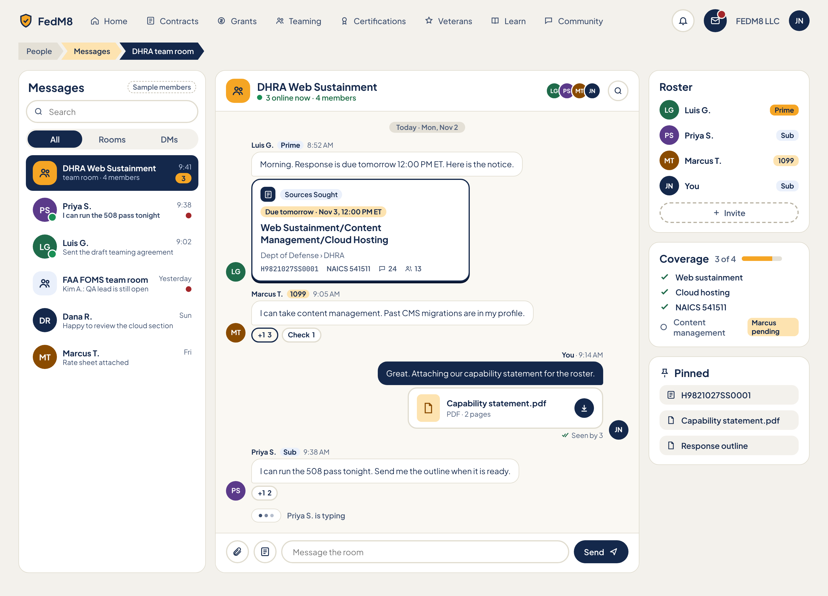
Eye path (after rules)
- 1 Breadcrumb People > Messages > room (depth 3)
- 2 Left: conversation list (All / Rooms / DMs); active row cream tint + bold (R1), unread dots and counts
- 3 Centre: room header (name, online count, members, Coverage chip) then messages; contract ContractEmbedCard inside the first message
- 4 Composer at bottom: Attach, Link contract, text input, Send (the single amber button)
- 5 Right: Roster, Coverage (3 of 4), Pinned
Change from the comp
- Page note: keep three-column layout as the pattern for every chat surface
- Page note: add 'Coverage 3 of 4' chip to the room header so coverage is visible without the right rail
- R1: active conversation row is cream tint + bold title (comp navy fill); All/Rooms/DMs selected segment uses chip-selected style (not navy)
- R2: Send becomes the amber PrimaryButton (comp navy); it is the only amber button on the page
- R4: breadcrumb kept (depth 3); current segment not navy-filled
- R5: contract card due chip uses --fm-urgent (due in <=48h)
- R7: no navy chips; segmented control selected = chip-selected-bg
- R8: message meta (names, times, badges, previews) at least 13px (comp 12px)
- R9: unread counts show only when >0; no placeholder numerals
- Contract card in chat loses navy border and hard shadow, uses neutral border
- Remove SampleChip before ship
- Roster RoleBadge colours: use the same RoleBadge styles as other pages instead of amber Prime
Modules (12)
- 1. App header
AppHeaderheader- FedM8 logo
- PillNav 8 pills; Teaming active (comp)
- Notifications IconButton
- Messages IconButton with red unread dot
- WorkspaceSwitcher 'FEDM8 LLC'
- Avatar JN
- nav click navigates
- Messages icon returns to this page
- 2. Breadcrumb
ChevronBreadcrumbheader- People
- Messages (accent-soft link)
- DHRA team room (current)
- click Messages deselects conversation (list view on mobile)
- 3. Conversation list header and search
SearchFieldleft- H2 'Messages'
- SampleChip 'Sample members' (comp-only)
- SearchField 'Search'
- SegmentedControl All / Rooms / DMs (All selected)
- typing searches conversation names and message text
- segment filters list to rooms or direct messages
- compose-new DM IconButton (added) opens member picker
- 4. Conversation list
ChatListleft Pro social- Row 1 (active): team room icon (amber square), 'DHRA Web Sustainment', time 9:41, 'team room · 4 members', unread badge 3
- Row 2: DM Priya S. with online dot, time 9:38, bold preview 'I can run the 508 pass tonight', red unread dot
- Row 3: DM Luis G. online, 9:02, 'Sent the draft teaming agreement'
- Row 4: group 'FAA FOMS team room', Yesterday, 'Kim A.: QA lead is still open', unread dot
- Row 5: DM Dana R., Sun, 'Happy to review the cloud section'
- Row 6: DM Marcus T., Fri, 'Rate sheet attached'
- click row opens conversation
- unread rows bold preview; opening clears unread
- overflow per row: mute, pin, mark unread
- relative time: today HH:MM, yesterday, weekday
- 5. Room header
PageTitlemain social- Room icon
- H1 'DHRA Web Sustainment'
- TrackingBar-style presence line '3 online now · 4 members' with green dot
- AvatarStack of members (LG, PS, MT, JN)
- Search-in-room IconButton
- Coverage chip 'Coverage 3 of 4' (added by page note; visible without the right rail)
- click AvatarStack or Coverage chip scrolls/opens the right rail (drawer on small screens)
- search IconButton opens in-room search with result list and jump to message
- 6. Message stream
ChatBubblemain social- Date divider 'Today · Mon, Nov 2'
- Msg 1 Luis G. (Prime badge, 8:52 AM): 'Morning. Response is due tomorrow 12:00 PM ET. Here is the notice.'
- Msg 2 Marcus T. (1099 badge, 9:05 AM): 'I can take content management. Past CMS migrations are in my profile.' with ReactionChips '+1 3' (pressed) and 'Check 1'
- Msg 3 You (9:14 AM, navy bubble right-aligned): 'Great. Attaching our capability statement for the roster.' + FileCard + 'Seen by 3'
- Msg 4 Priya S. (Sub badge, 9:38 AM): 'I can run the 508 pass tonight. Send me the outline when it is ready.' with ReactionChip '+1 2'
- TypingIndicator 'Priya S. is typing'
- scroll up loads older messages (infinite)
- hover/focus message shows reply, react, pin, copy actions
- click ReactionChip toggles own reaction and updates count
- new message auto-scrolls only when user is at the bottom; otherwise shows 'N new' pill
- own messages right-aligned with seen count
- author name click opens Member profile
- Check reaction on a 'I can' message can mark the requirement as covered (sync to Coverage)
- 7. Contract card in chat
ContractEmbedCardmain social- Card inside Luis's message: doc icon, TypeBadge 'Sources Sought', red UrgencyChip 'Due tomorrow · Nov 3, 12:00 PM ET'
- Title 'Web Sustainment/Content Management/Cloud Hosting'
- Agency 'Dept of Defense › DHRA' (13px)
- Meta row: solicitation H9821027SS0001 (mono), NAICS 541511, comments 24, team 13
- Card is a link with aria-label 'Open contract ...'; comp border is navy with hard shadow, v2 uses neutral border
- click opens Contract detail
- composer 'Link a contract' inserts this card type
- 8. File attachment
FileCardmain social- File icon tile (accent-soft)
- Name 'Capability statement.pdf' (ellipsis)
- Meta 'PDF · 2 pages'
- Download IconButton (aria-label 'Download Capability statement.pdf')
- 'Seen by 3' with double-check icon below the message
- click name previews PDF
- download button downloads
- pinning from message menu adds to Pinned
- 9. Composer
Composerbottom social- Attach file IconButton
- Link a contract IconButton
- Text input 'Message the room' with hidden label 'Message DHRA team room'
- Send PrimaryButton with send icon (amber in v2)
- Enter sends, Shift+Enter newline
- Attach opens file picker and shows upload chip before send
- Link a contract opens picker of tracked notices
- typing triggers TypingIndicator for others
- Send disabled when empty
- @mention opens member list (added)
- 10. Roster
RosterListright Pro social- H2 'Roster'
- 4 rows: Luis G. Prime; Priya S. Sub; Marcus T. 1099; You (JN) Sub
- RoleBadge on each (Prime amber in comp; v2 uses neutral RoleBadge styles consistent across pages)
- Invite dashed button with plus icon
- click member opens profile
- Invite opens member picker / Teaming matches
- own row marked 'You'
- roster contact actions are Pro-gated
- 11. Coverage
CoverageMeterright social- H2 'Coverage' + '3 of 4' + progress bar 75%
- 4 requirement rows: Web sustainment (covered), Cloud hosting (covered), NAICS 541511 (covered), Content management (open, muted circle) with chip 'Marcus pending'
- click a requirement scrolls to the requirement on Contract detail
- 'pending' chip opens the member's claim
- covered state changes when a member's 'I can do this' is confirmed
- 12. Pinned
FileCardright social- H2 'Pinned' with pin icon
- 3 link rows: H9821027SS0001 (contract icon), Capability statement.pdf (file icon), Response outline (file icon)
- click opens item
- unpin from overflow menu
Features (14)
- Conversation list with search, All/Rooms/DMs filter, unread dots and counts, presence
- Team room and DM conversation types
- Room header with online count, members, search-in-room, Coverage chip
- Chat messages with author, role badge, time, own-message alignment
- Reactions (+1, Check) with counts
- Contract card embedded in chat
- File attachments with preview/download
- Read receipts ('Seen by N')
- Typing indicator
- Composer: attach, link contract, send
- Roster with role badges and Invite
- Requirement Coverage with progress and pending claims
- Pinned contract and files
- Header nav, notifications, workspace
Acceptance checklist (27)
Responsive · accessibility · open questions
<=1024: two panes; conversation list collapses into a drawer opened by a back/list IconButton, right info rail becomes a drawer opened from the Coverage chip or members AvatarStack. <=480: single pane at a time: list view then chat view with back arrow; Composer sticky bottom with 44px targets; info drawer is a bottom sheet; BottomTabBar hides inside an open chat.
- Landmarks: banner, nav Main, nav Breadcrumb, complementary aria-label Conversations, main/region aria-label '<room> chat', complementary aria-label Room info
- Message list has role=log with aria-live=polite; new incoming messages are announced, typing indicator announced politely
- Each message has an accessible name 'Name, role, time, text'
- Unread indicators have text alternatives ('Unread', '3 unread')
- ReactionChips are toggle buttons with aria-pressed and count in label
- Composer input has a label; Send, Attach, Link contract IconButtons have aria-labels
- Presence dots have text alternatives
- Keyboard: Tab order list > chat > composer > info; Esc closes drawers; Ctrl/Cmd+K focuses list search (optional)
- Are team rooms auto-created per tracked notice, or created manually?
- Who can see a room: only roster members, or anyone tracking the notice (read-only)?
- Are DMs Pro-gated for the sender only or both sides? Comp shows DMs in the list without lock
- Does a 'Check' reaction from a member mark a requirement as covered automatically?
- Is 'Seen by N' shown in rooms of any size or only small teams?
- File storage limits and allowed types are not defined
- Room 'You' role shows Sub while pipeline context shows the user as FEDM8 LLC: define how the viewer's role is set per notice
Community
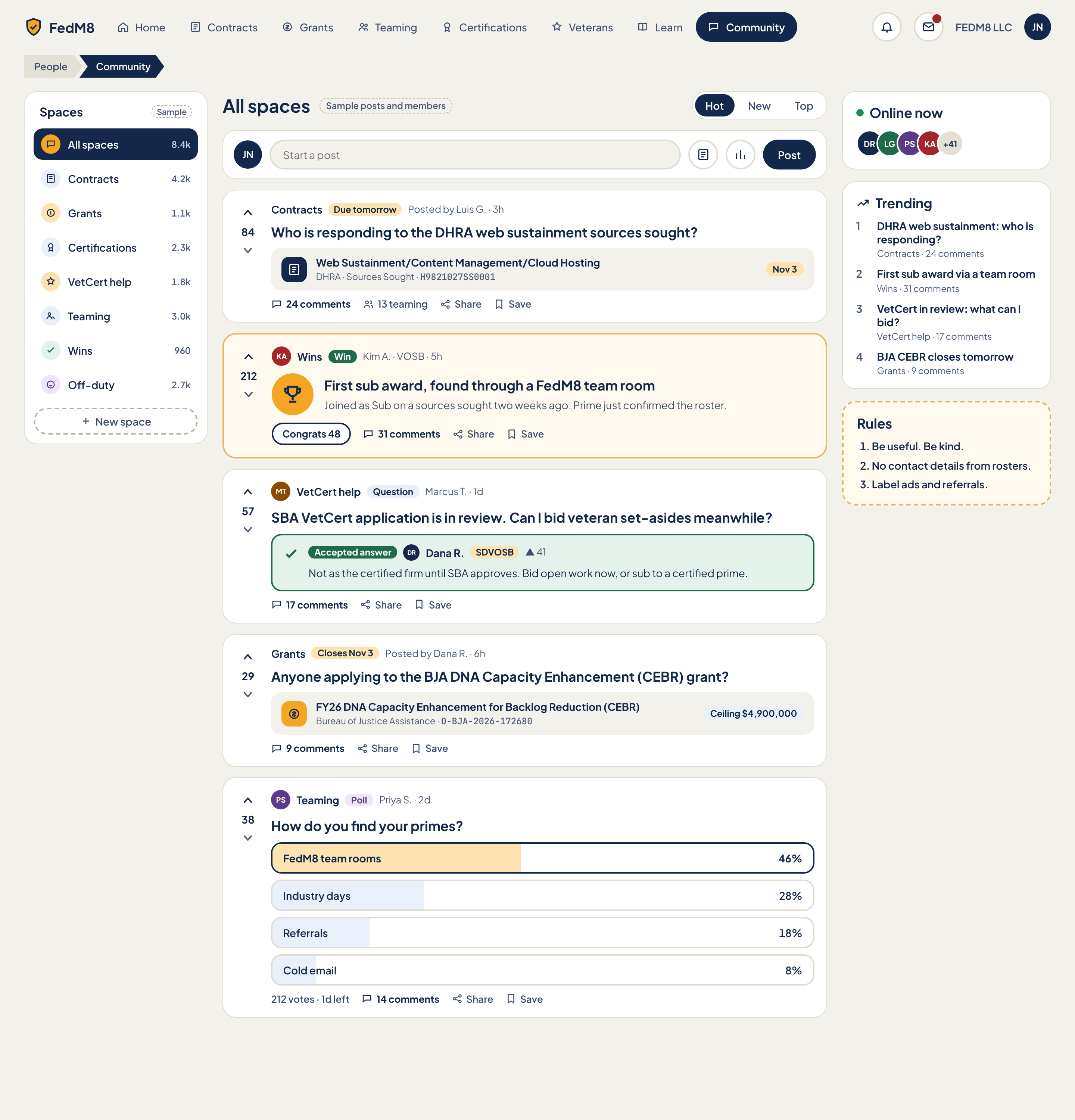
Eye path (after rules)
- 1 H1 with the active Space name ('All spaces') and the Hot/New/Top SortTabs on the same row (no breadcrumb, R4: Community is a top-level page)
- 2 Composer with the single amber Post button (R2)
- 3 Feed top to bottom. Every card uses the same white surface; amber appears only on badges (Win badge, urgency chips by R5)
- 4 Left rail Spaces (cream tint on the current Space, R1) for changing context; right rail Online now, Trending, Rules for secondary scanning
- 5 Linked contract/grant cards inside posts use the same styling as list rows, with urgency colour by days left (R5)
Change from the comp
- Win post: white --fm-surface card, amber only on the 'Win' badge and trophy; remove the amber card fill and 2px gold border (page note)
- Contract and grant embed cards match list-row styling (same radius, border, type scale, urgency chip) instead of a grey inset block
- Post button becomes amber --fm-action (R2); comp used navy
- Sort tabs and Spaces selection: Hot tab uses chip-selected style (R7); current Space row uses cream row-selected plus bold (R1), not navy fill
- Remove the 'People > Community' breadcrumb (R4, top-level page); page starts with H1
- Due chips coloured by days left: 'Due tomorrow' and 'Closes Nov 3' red when <=48h, warn when <=7d (R5); comp used amber for all
- Meta text (byline, embed sub-line, trending meta, counts) raised from 12px to 13px minimum (R8); 12px only for badges
- Space counts (8.4k etc) hidden until real, labelled with unit (R9)
- Online dot uses --fm-success, not a hard-coded green
- SampleChip elements removed from shipped build
Modules (13)
- 1. App header and PillNav
AppHeaderheader- FedM8 logo/home link
- PillNav: Home, Contracts, Grants, Teaming, Certifications, Veterans, Learn, Community (Community is the navy active pill)
- Notifications IconButton
- Messages IconButton with unread PresenceDot-style red dot
- WorkspaceSwitcher label 'FEDM8 LLC'
- Avatar (user initials JN)
- click nav pill -> navigates, active pill navy (R1)
- click bell -> notifications panel
- click messages -> /os#/messages
- click workspace name -> WorkspaceSwitcher menu
- click avatar -> account menu
- 2. Spaces list
ThreadList (left rail list of Spaces)left social- Heading 'Spaces'
- Rows: All spaces, Contracts, Grants, Certifications, VetCert help, Teaming, Wins, Off-duty
- Per-row round icon (colour-coded) and member/post count
- 'New space' dashed outline button
- SampleChip next to heading (comp only)
- click row -> filters feed and updates H1 and URL ?space=
- click New space -> create-space dialog (name, icon, description, who can post)
- keyboard: arrow keys move between rows, Enter selects
- 3. Feed title and sort
PageTitle + SortTabsmain social- H1 with current Space name
- SampleChip 'Sample posts and members' (comp only)
- SortTabs Hot / New / Top
- click sort tab -> re-sorts feed, updates ?sort=, keeps scroll at top
- arrow keys move between tabs
- 4. Start a post
Composermain social- Avatar
- Text field 'Start a post'
- IconButton 'Link a contract'
- IconButton 'Start a poll'
- PrimaryButton 'Post' (amber per R2)
- focus field -> expands to title, body, Space picker, post-type (Discussion/Question/Poll/Win)
- Link a contract -> search picker for a notice or grant, inserts ContractEmbedCard
- Start a poll -> adds 2-6 option inputs and a duration
- Post -> publishes to the selected Space, prepends to New, disabled if empty or rate-limited
- Esc collapses without losing draft
- 5. Contract thread post
ThreadPost + ContractEmbedCardmain social- VoteRail (up, score 84, down)
- Space link 'Contracts'
- UrgencyChip 'Due tomorrow'
- Byline 'Posted by Luis G. · 3h'
- Title 'Who is responding to the DHRA web sustainment sources sought?'
- ContractEmbedCard: icon, title, agency, notice type, solicitation number (mono), due-date chip 'Nov 3'
- Action row: N comments, N teaming, Share, Save
- up/down vote toggles, one vote per user, score updates optimistically
- click title or comments -> thread view
- click embed card -> contract detail /os#/opportunities?notice=<id>
- click teaming count -> Teaming room for that notice
- Share -> copy link/share sheet
- Save -> toggles bookmark
- 6. Win post
WinCard + ThreadPostmain social- VoteRail (score 212)
- Avatar KA, Space 'Wins', green 'Win' badge, byline 'Kim A. · VOSB · 5h' with CertBadge
- Trophy icon in amber circle
- Title 'First sub award, found through a FedM8 team room'
- Body line
- 'Congrats 48' ReactionChip button
- N comments, Share, Save
- Congrats toggles reaction and increments count
- vote, comment, share, save as other posts
- click author -> member profile
- 7. Question post with accepted answer
ThreadPost + accepted answer blockmain social- VoteRail (57)
- Space 'VetCert help', blue 'Question' badge, byline 'Marcus T. · 1d'
- Title 'SBA VetCert application is in review. Can I bid veteran set-asides meanwhile?'
- Accepted answer block (green): check icon, 'Accepted answer' badge, answerer Dana R. with SDVOSB CertBadge, vote count, answer text
- 17 comments, Share, Save
- asker can mark one answer accepted (moves it to top of thread)
- vote on answer separately
- click answer -> scrolls to it in thread
- 8. Grant thread post
ThreadPost + ContractEmbedCard (grant)main social- VoteRail (29)
- Space 'Grants', UrgencyChip 'Closes Nov 3', byline 'Posted by Dana R. · 6h'
- Title 'Anyone applying to the BJA DNA Capacity Enhancement (CEBR) grant?'
- Grant embed card: icon, title, agency 'Bureau of Justice Assistance', opportunity number O-BJA-2026-172680 (mono), 'Ceiling $4,900,000' chip
- 9 comments, Share, Save
- same as contract thread; embed opens grant detail
- 9. Poll post
ThreadPost + pollmain social- VoteRail (38)
- Avatar PS, Space 'Teaming', purple 'Poll' badge, byline 'Priya S. · 2d'
- Title 'How do you find your primes?'
- 4 option bars: FedM8 team rooms 46%, Industry days 28%, Referrals 18%, Cold email 8% (user's pick outlined)
- Footer '212 votes · 1d left', 14 comments, Share, Save
- click option -> casts vote, reveals percentages, one choice, changeable until close
- after close options disable and winner is bolded
- percent bars animate (respect reduce motion)
- 10. Online now
AvatarStack + PresenceDotright social- Heading with green PresenceDot
- AvatarStack of 4 members plus '+41'
- hover/focus avatar -> name tooltip
- click avatar -> member profile
- click +N -> list of online members
- 11. Trending
ThreadListright social- Heading with trend icon
- Numbered list of 4 items: title, Space, N comments
- click item -> thread view
- 12. Community rules
Checklist (static card, dashed border)right- Heading 'Rules'
- 3 numbered rules: Be useful. Be kind. / No contact details from rosters. / Label ads and referrals.
- none; 'Report' action on every post links back to rules
- 13. Feed empty, loading, end, error
EmptyState + LoadingSkeleton + ErrorStatemain- Empty Space message with 'Start a post' prompt
- Skeleton post cards
- 'You're all caught up' end marker or infinite load more
- Error with Retry
- scroll to bottom -> loads next page
- Retry reloads
Features (15)
- Switch between Spaces (All spaces, Contracts, Grants, Certifications, VetCert help, Teaming, Wins, Off-duty)
- Create a new Space
- Sort feed Hot / New / Top
- Create a post, question, poll or win from one composer
- Link a contract or grant into a post (embed card)
- Upvote and downvote posts and answers
- Mark an accepted answer on a question
- Vote in a poll with live percentages and a countdown
- Congrats reaction on win posts
- Comment count opens thread view; teaming count opens the team room
- Share and Save any post
- See who is online and trending threads
- Rules card; no roster contact details in posts
- Urgency colour on due/close chips (R5)
- Runtime theming via tokens only
Acceptance checklist (24)
Responsive · accessibility · open questions
<=1024: Spaces rail becomes a horizontal scrolling row of FilterChips above the feed; right rail stacks below the feed (Trending first, then Online now, Rules). <=480: single column, BottomTabBar replaces PillNav, composer collapses to a FAB that opens a full-screen Composer, vote rail stays at left of each card, action row wraps, tap targets >=44px, bottom padding equals FAB height so it never covers the last card's actions.
- Landmarks: header, nav 'Main', nav 'Spaces', main, aside 'Community highlights'
- H1 is the Space name; each post title is an h2
- Vote buttons have aria-labels and aria-pressed; score announced via aria-live=polite
- Sort tabs are a role=group with aria-pressed buttons, or tablist with arrow keys
- Poll options are radio-like with aria-checked and result percentages in text, not colour only
- AvatarStacks have role=img with full names in aria-label
- Urgency conveyed by text plus colour
- Visible focus ring --fm-focus-ring on all controls; tab order: nav, Spaces, sort, composer, feed, right rail
- Respect prefers-reduced-motion for bar animation
- ACCURACY/LEGAL CHECK REQUIRED: the sample accepted answer ('Not as the certified firm until SBA approves. Bid open work now, or sub to a certified prime.') on bidding veteran set-asides while VetCert is in review has not been verified against SBA/FAR rules and must be reviewed for accuracy and legal correctness before any real use; the shipped build must not seed or display it as guidance, and an 'Accepted answer' on VetCert/legal topics should carry a 'Community answer, not legal advice' note
- Who may mark an accepted answer: asker only, or moderators too
- Moderation model: reporting, removal, roles, spam control, who can create Spaces
- How are the Space counts defined (members, posts, or active) and are they shown at all
- Do role/cert badges on authors come only from verified profile data
- Is downvoting allowed in all Spaces, and does it affect Hot ranking
- Are the Wins and Off-duty Spaces visible to non-veterans
- Rule enforcement for 'No contact details from rosters' (auto-detect vs report only)
- Does 'N teaming' count equal team-room members or distinct teams
Veterans
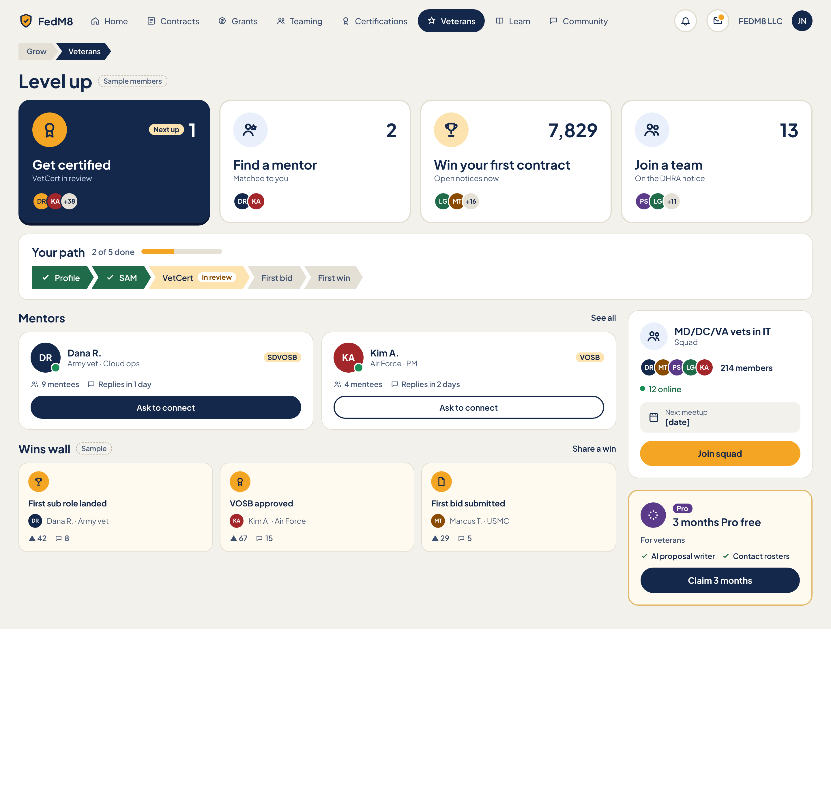
Eye path (after rules)
- 1 H1 'Level up' (no breadcrumb, R4: Veterans is top-level and pinned in the nav)
- 2 'Your path' ChevronStepper directly under the H1 (Profile, SAM, VetCert, First bid, First win) with '2 of 5 done' and progress bar; this is the where-am-I element
- 3 Choose your next move: 4 ChoiceCards. 'Get certified' has an amber 'next up' ring, not navy selected (R1); label first, count second (R6)
- 4 Mentors then Wins wall in the main column
- 5 Right rail: Squad, then Veterans Pro offer (outline button; amber is reserved for the one primary)
Change from the comp
- Move 'Your path' ChevronStepper directly under the H1, above the choice cards (page note)
- 'Get certified' card: amber --fm-action ring and 'Next up' badge for next-up; remove navy selected fill (R1: navy only for user-selected)
- Remove 'Grow > Veterans' breadcrumb (R4)
- Choice cards: label first (type-xl), count second (type-md muted with unit word) (R6); '7,829' and '13' get unit words 'notices' and 'people'
- Exactly one primary: 'Continue to VetCert'; 'Join squad', 'Ask to connect' and 'Claim 3 months' are outline (R2)
- Squad 'Next meetup [date]' must be hidden when no real date (R9)
- Meta text (mentor subtitle, reply time, win author) at least 13px (R8)
- Remove SampleChips from shipped build
Modules (9)
- 1. App header and PillNav
AppHeaderheader- Logo
- PillNav with Veterans as navy active pill
- Notifications IconButton
- Messages IconButton with unread dot
- WorkspaceSwitcher 'FEDM8 LLC'
- Avatar
- same as global header
- 2. Level up title
PageTitlemain- H1 'Level up'
- SampleChip 'Sample members' (comp only)
- none
- 3. Your path
ChevronStepper + ProgressCardmain- Heading 'Your path'
- Progress text '2 of 5 done'
- Progress bar
- 5 chevron segments: Profile, SAM, VetCert (current, 'In review' tag), First bid, First win
- Done segments with check, future segments muted
- PrimaryButton 'Continue to VetCert' (v2)
- click a done step -> opens that step's page (Profile, SAM registration)
- click current step -> opens the certification walk-through
- future steps are focusable but show what unlocks them
- primary button jumps to the current step's task
- 4. Choose your next move
ChoiceCard x4 + AvatarStackmain social- Heading (visually part of section)
- Card 1 'Get certified' - 'VetCert in review' - 'Next up' badge - step number 1 - avatars DR KA +38
- Card 2 'Find a mentor' - 'Matched to you' - number 2 - avatars DR KA
- Card 3 'Win your first contract' - 'Open notices now' - count 7,829 - avatars LG MT +16
- Card 4 'Join a team' - 'On the DHRA notice' - count 13 - avatars PS LG +11
- Icon/picture area on each card
- click Get certified -> /os#/certifications (SDVOSB walk-through)
- click Find a mentor -> scrolls to Mentors
- click Win your first contract -> Contracts list filtered to set-asides the user qualifies for
- click Join a team -> Teaming room for the DHRA notice
- hover/focus avatar stack -> names
- 5. Mentors
MentorCard x2main social- Heading 'Mentors' with 'See all' link
- Card: Avatar with PresenceDot, name, 'Army vet · Cloud ops', CertBadge SDVOSB, 'Replies in 1 day', 'Ask to connect' button
- Card 2: Kim A., Air Force PM, VOSB, 'Replies in 2 days'
- Ask to connect -> opens message composer pre-filled; sets button to 'Requested'
- click name/avatar -> member profile
- See all -> mentor directory with filters (branch, skill, cert)
- 6. Wins wall
WinCard x3main social- Heading 'Wins wall' with SampleChip and 'Share a win' link
- 3 WinCards: icon, title (First sub role landed / VOSB approved / First bid submitted), author with branch, vote count (42 / 67 / 29), comment count (8 / 15 / 5)
- click card -> win post in Community (Wins Space)
- Share a win -> Composer pre-set to Win
- vote/comment counts link to the thread
- 7. Squad
SquadCard + TrackingBarright social- Icon and title 'MD/DC/VA vets in IT' with 'Squad' label
- AvatarStack of 5
- '214 members'
- '12 online' with PresenceDot
- Next meetup row with date
- 'Join squad' button (outline)
- Join squad -> adds user, button becomes 'Joined', opens squad chat
- click title -> squad page / chat
- meetup row -> add to calendar
- 8. Veterans Pro offer
PlanCard + ProTagright- Pro icon and ProTag, title '3 months Pro free'
- 'For veterans' label
- Two feature chips: AI proposal writer, Contact rosters
- 'Claim 3 months' button (outline)
- Claim 3 months -> starts trial, no card required (confirm), card changes to 'Trial: N days left'
- feature chips link to the feature explainer
- hidden once Pro is active and not on trial
- 9. Page empty, loading, error
EmptyState + LoadingSkeleton + ErrorStatemain- New-user state (0 of 5 done)
- Section skeletons
- Per-section error with Retry
- Retry reloads the failed section only
Features (9)
- Five-step veteran path with progress and current step
- Four next-move cards with peer avatars and counts
- Recommended next move highlighted with an amber ring
- Mentor matching and Ask to connect
- Wins wall and Share a win
- Join a regional squad and see online members
- Claim 3 months of Pro free (veterans)
- Veterans, Learn and Community always visible in the main nav (never under All tools)
- FEDM8 LLC shows no SDVOSB status, never certified or in review
Acceptance checklist (19)
Responsive · accessibility · open questions
<=1024: right rail (Squad, Pro) stacks below Wins wall; ChoiceCards go 2x2; ChevronStepper keeps all 5 segments with short labels. <=480: single column; ChevronStepper becomes a compact 'Step 3 of 5: VetCert' bar with a scrollable segment row; ChoiceCards stack full width; BottomTabBar replaces PillNav; the primary button becomes full width under the stepper.
- Landmarks: header, nav 'Main', main with sections labelled 'Your path', 'Choose your next move', 'Mentors', 'Wins wall'; aside 'Squad and Pro'
- Stepper is an ol with aria-current=step on the current item; done/future conveyed in text for screen readers
- ChoiceCards are links or buttons with accessible names including label and count
- AvatarStacks have role=img with names
- Progress bar has role=progressbar with aria-valuenow
- Focus ring on all controls; focus order follows eye path
- Colour is never the only indicator for next-up (badge text present)
- How is veteran status verified to unlock the 3 months Pro, and is a card required
- What event ends the trial and what happens to data and rosters at trial end
- How are mentors recruited and approved; is there a safety/vetting process
- How are squads formed (location plus industry) and who can create one
- What is the 'First win' definition for the path step (awarded contract entered in pipeline?)
- Whether Wins wall entries are opt-in
- Should steps be reorderable or is the 5-step path fixed
- How is 'Next up' chosen (rules or AI)
Certifications walk-through
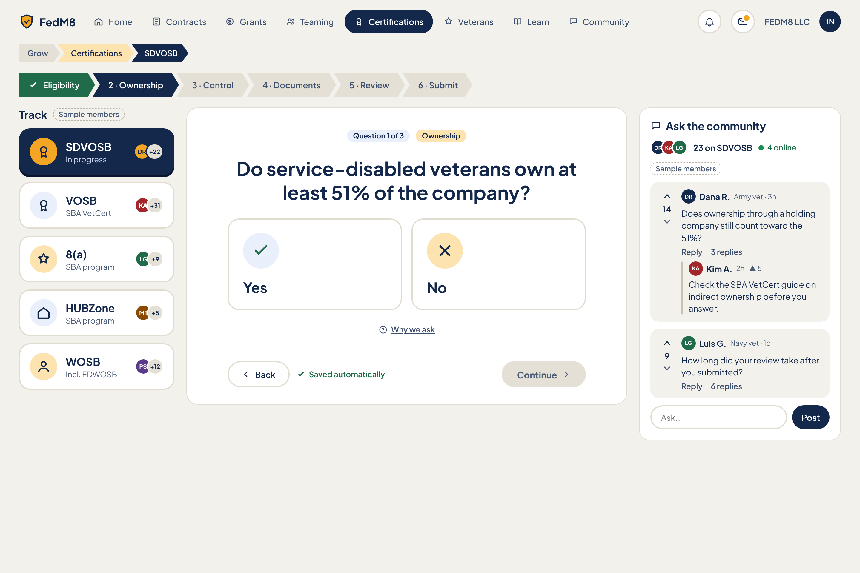
Eye path (after rules)
- 1 ChevronBreadcrumb (depth 3: Grow > Certifications > SDVOSB, R4)
- 2 ChevronStepper of the 6 steps (Eligibility, Ownership, Control, Documents, Review, Submit) with current step
- 3 Track chip 'SDVOSB · change' (the picker collapses once a track is chosen)
- 4 Single QuestionCard: 'Question 1 of 3', H1 question, Yes/No ChoiceCards, 'Why we ask'
- 5 Back / Saved automatically / Continue (amber, bottom-right)
- 6 'Ask' drawer (collapsed by default) for community help, opened on demand
Change from the comp
- After a track is chosen, collapse the picker to one chip 'SDVOSB · change' (page note); the left column no longer competes with the question
- Community panel becomes a collapsible 'Ask' drawer, closed by default (page note)
- Continue is the single amber primary at bottom-right (R2); Back is outline
- Selected track and selected Yes/No are the only navy fills (R1); the 'SDVOSB' chip uses chip-selected style (R7)
- Track cards: label first, count second with unit word 'members' (R6); no placeholder counts (R9)
- Meta text (author line, replies, vote counts, sublabels) minimum 13px (R8)
- Breadcrumb kept since depth is 3 (R4); 'Grow' must link to a real page
- Remove SampleChips from shipped build
Modules (7)
- 1. App header and PillNav
AppHeaderheader- Logo
- PillNav with Certifications as navy active pill
- Notifications
- Messages with unread dot
- WorkspaceSwitcher 'FEDM8 LLC'
- Avatar
- same as global header
- 2. Breadcrumb
ChevronBreadcrumbheader- Grow (link)
- Certifications (link)
- SDVOSB (current)
- click Grow -> Veterans/Grow hub
- click Certifications -> track list/overview
- current segment is not a link
- 3. Certification steps
ChevronSteppermain- 6 segments: Eligibility, 2 Ownership (current), 3 Control, 4 Documents, 5 Review, 6 Submit
- done / current / upcoming styles
- click a completed step -> jumps back to it
- upcoming steps not clickable until reached (aria-disabled)
- advancing via Continue updates it
- 4. Track picker
TrackPicker (ChoiceCard x5) collapsing to chipleft social- Heading 'Track' with SampleChip
- 5 ChoiceCards: SDVOSB (In progress, DR +22), VOSB (SBA VetCert, KA +31), 8(a) (SBA program, LG +9), HUBZone (SBA program, MT +5), WOSB (Incl. EDWOSB, PS +12)
- After choice: collapsed chip 'SDVOSB · change'
- click a track -> selects it (navy selected card, R1) then collapses to the chip
- click 'change' -> expands picker; switching track keeps saved answers per track
- avatars show people on that track
- 5. Question
QuestionCardmain- Counter 'Question 1 of 3' and section tag 'Ownership'
- H1 'Do service-disabled veterans own at least 51% of the company?'
- Yes / No ChoiceCards with icons
- 'Why we ask' link
- Footer: Back (outline), 'Saved automatically' text, Continue (amber, disabled until answered)
- select Yes/No -> card navy (selected), Continue enables, answer autosaves
- Continue -> next question; after last question of a step -> next step
- Back -> previous question, answer retained
- Why we ask -> inline explainer or drawer with the rule and source link
- keyboard: Y/N or arrows, Enter to continue
- answers that make the user ineligible show an inline notice with next options, not a hard stop
- 6. Ask the community
Drawer + ThreadList + Composerdrawer social- Trigger button 'Ask' with icon
- Heading 'Ask the community'
- AvatarStack (DR KA LG), '23 on SDVOSB', '4 online'
- SampleChip
- Thread 1: VoteRail 14, Dana R. Army vet 3h, 'Does ownership through a holding company still count toward the 51%?', Reply, '3 replies', nested reply from Kim A. 2h with 5 votes
- Thread 2: VoteRail 9, Luis G. Navy vet 1d, 'How long did your review take after you submitted?', Reply, '6 replies'
- Composer 'Ask…' input and Post button
- collapsed by default; opens as right-hand drawer over the page (does not shrink the question)
- vote, Reply, nested thread expand
- Post -> adds a question tagged to the SDVOSB track and the current step
- close with Esc or X, focus returns to trigger
- thread list is filtered to the current track and step
- 7. Page empty, loading, error
EmptyState + LoadingSkeleton + ErrorStatemain- No track chosen state
- Completed state after last step ('Ready to submit' summary)
- Load/save error with Retry
- Retry reloads or re-saves
Features (10)
- Pick a certification track (SDVOSB, VOSB, 8(a), HUBZone, WOSB/EDWOSB)
- Picker collapses to a chip 'SDVOSB · change' after choice
- Six-step chevron progress with jump back to done steps
- One question per screen with Yes/No answers
- Why we ask explainer
- Back and Continue navigation; Continue disabled until answered
- Autosave with visible status
- Community Ask drawer with votes, replies and a composer, scoped to track and step
- Peers on the same track and who is online
- FEDM8 LLC shows no SDVOSB status, never certified or in review
Acceptance checklist (19)
Responsive · accessibility · open questions
<=1024: breadcrumb and stepper stay at top; the track picker is already collapsed to the chip; the Ask drawer slides over from the right at 60% width. <=480: stepper shows 'Step 2 of 6: Ownership' with a scrollable segment row; question card full width; Yes/No cards stack; Back and Continue stay in a sticky bottom bar with Continue on the right; Ask becomes a bottom sheet; BottomTabBar hidden during the wizard to avoid two bottom bars.
- One question per screen; H1 is the question; focus moves to the H1 on step change and the change is announced via aria-live
- Yes/No are radio-style buttons with aria-pressed or role=radio
- Stepper is an ol with aria-current=step; disabled steps aria-disabled
- Saved status in an aria-live=polite region
- Drawer is role=complementary dialog with focus trap, Esc to close, focus return to the trigger
- Breadcrumb nav with aria-label and aria-current=page
- Visible focus ring; Continue disabled state explained via aria-describedby
- Exact question set for each track and step (the comp shows only SDVOSB Question 1 of 3); needs review against SBA VetCert rules before use
- Does the walk-through only guide, or does it also submit/store documents with SBA
- Document upload requirements and storage for the Documents step
- How are ineligible answers handled (block, warn, route to another track)
- Is 'Eligibility' step numbered (comp shows it unnumbered)
- Should community threads in the drawer be moderated for advice accuracy on legal questions
- How many tracks can one user work on in parallel
- How is 'In progress' on the SDVOSB card derived from the user's own saved progress
Learn
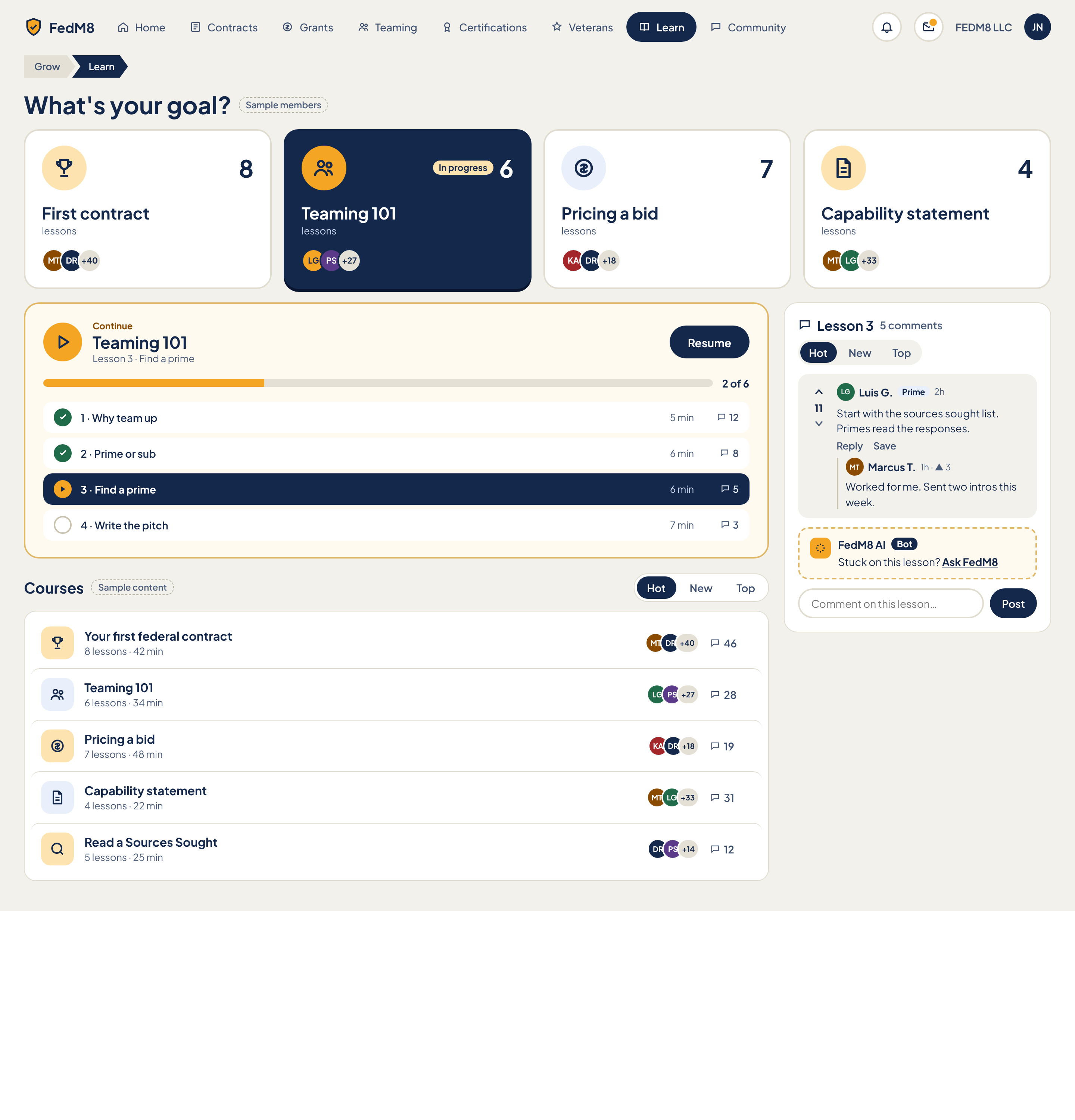
Eye path (after rules)
- 1 H1 'What's your goal?' (no breadcrumb, R4: Learn is top-level)
- 2 Four goal ChoiceCards: label first, count with unit 'lessons' second (R6); the in-progress goal has a light tint, not navy (page note)
- 3 Continue card: the one highlighted object on the page, with amber Resume at top-right (R2)
- 4 Lesson list inside Continue card; current lesson has a light cream tint + bold (R1), not navy
- 5 Courses list (sortable), then right rail Lesson discussion
Change from the comp
- Single highlight: the Continue card is the one emphasised object; goal card 'Teaming 101' gets a light tint and the current lesson row gets cream --fm-row-selected-bg + bold, no navy (page note, R1)
- Resume is the single amber primary at the card's top-right (R2); Post in the discussion is outline
- Remove 'Grow > Learn' breadcrumb (R4)
- Goal cards: label first, then count with unit word 'lessons' (R6)
- Sort tabs use chip-selected style (R7)
- Meta (durations, comment counts, role/time lines) minimum 13px (R8)
- Course row trailing number (46, 28...) must be labelled with a unit or hidden (R9)
- Remove SampleChips from shipped build
Modules (6)
- 1. App header and PillNav
AppHeaderheader- Logo
- PillNav with Learn as navy active pill
- Notifications
- Messages with unread dot
- WorkspaceSwitcher 'FEDM8 LLC'
- Avatar
- same as global header
- 2. What's your goal
ChoiceCard x4 + AvatarStackmain social- H1 "What's your goal?"
- SampleChip (comp only)
- Card 'First contract' - 8 lessons - MT DR +40
- Card 'Teaming 101' - 6 lessons - 'In progress' tag - LG PS +27
- Card 'Pricing a bid' - 7 lessons - KA DR +18
- Card 'Capability statement' - 4 lessons - MT LG +33
- Picture/icon area per card
- click a goal -> filters Courses and sets Continue to the first unfinished lesson of that goal's course
- selected goal is the user-chosen one (navy per R1 only for user selection)
- in-progress goal shows light tint and tag
- avatars show learners
- 3. Continue
ProgressCard + LessonListmain social- Icon, label 'Continue', H2 'Teaming 101', 'Lesson 3 · Find a prime'
- PrimaryButton 'Resume' (amber)
- Progress bar with '2 of 6'
- LessonList (4 shown): 1 Why team up (5 min, 12 comments, done), 2 Prime or sub (6 min, 8, done), 3 Find a prime (6 min, 5, current), 4 Write the pitch (7 min, 3)
- Per-lesson duration and comment count
- Resume -> opens the current lesson
- click any lesson -> opens it (done lessons replayable; locked lessons not applicable unless sequential rule set)
- click comment count -> opens that lesson's discussion in the right rail
- list shows 4 lessons with a 'Show all 6' control
- 4. Courses
CourseRow list + SortTabsmain social- Heading 'Courses', SampleChip, SortTabs Hot/New/Top
- 5 CourseRows: Your first federal contract (8 lessons · 42 min, MT DR +40, 46), Teaming 101 (6 · 34 min, LG PS +27, 28), Pricing a bid (7 · 48 min, KA DR +18, 19), Capability statement (4 · 22 min, MT LG +33, 31), Read a Sources Sought (5 · 25 min, DR PS +14, 12)
- Each row: icon, title, lesson count and duration, learner avatars, discussion count
- sort tab re-orders rows
- click row -> course page / first unfinished lesson
- click discussion count -> course discussion
- filtered by the chosen goal
- 5. Lesson discussion
ThreadList + ThreadPost + BotPost + Composerright social- Heading 'Lesson 3', '5 comments', SortTabs Hot/New/Top
- ThreadPost: VoteRail 11, Luis G. with RoleBadge 'Prime', 2h, body 'Start with the sources sought list. Primes read the responses.', Reply, Save, nested reply by Marcus T. 1h with 3 votes
- BotPost: FedM8 AI with 'Bot' ProTag-style badge, 'Stuck on this lesson? Ask FedM8' link
- Composer 'Comment on this lesson…' with Post button (outline)
- vote, Reply (nested), Save
- sort tabs re-order
- Ask FedM8 -> opens AI chat scoped to the lesson
- Post -> adds comment; thread follows the lesson selected in Continue
- changing lesson swaps the thread
- 6. Page empty, loading, error
EmptyState + LoadingSkeleton + ErrorStatemain- No goal chosen state
- Course completed state ('All lessons done' with next suggestion)
- Section errors with Retry
- Retry reloads the section
Features (8)
- Choose a learning goal from four paths
- Resume the in-progress course at the current lesson
- Progress bar and lesson list with durations and per-lesson comment counts
- Browse and sort a course catalogue
- See other learners via avatar stacks
- Reddit-style discussion on each lesson with votes, nested replies and Save
- FedM8 AI helper inside the lesson discussion
- Learn is always visible in the main nav
Acceptance checklist (20)
Responsive · accessibility · open questions
<=1024: Lesson discussion moves below Courses as a collapsible section opened from the Continue card's lesson comment counts; goal cards go 2x2. <=480: goal cards become a horizontal scroll row or stack full width; Continue card full width with Resume full-width under the title; discussion opens as a bottom sheet from the lesson row; BottomTabBar replaces PillNav.
- Landmarks: header, nav 'Main', main with sections 'Pick a goal', 'Continue', 'Courses'; aside 'Lesson discussion'
- H1 is the goal question; course and lesson titles use h2/h3
- Progress bar has role=progressbar with aria-valuenow and text '2 of 6'
- Lesson list is an ol with aria-current=step on the current lesson; done state also in text for screen readers
- Goal cards use aria-pressed; AvatarStacks role=img with names
- Vote buttons have aria-label and aria-pressed
- Bot messages carry an accessible 'Bot' label
- Visible focus ring; tab order: nav, goals, Resume, lessons, courses, discussion
- Who authors the course content (the sample titles, counts and minutes are placeholders); no course content should be shown that does not exist
- Are lessons sequential-locked or freely navigable
- What does the unlabelled trailing number on each course row mean (comments, learners, completions)
- Why does 'Read a Sources Sought' appear in Courses without a goal card
- Does the lesson list show all lessons or four plus 'Show all'
- Is the AI helper Pro-gated or free; what does it have access to
- Is there a certificate or completion state, and does it feed 'Your path' on Veterans
- Should lesson discussion be visible to non-members
Plan & settings
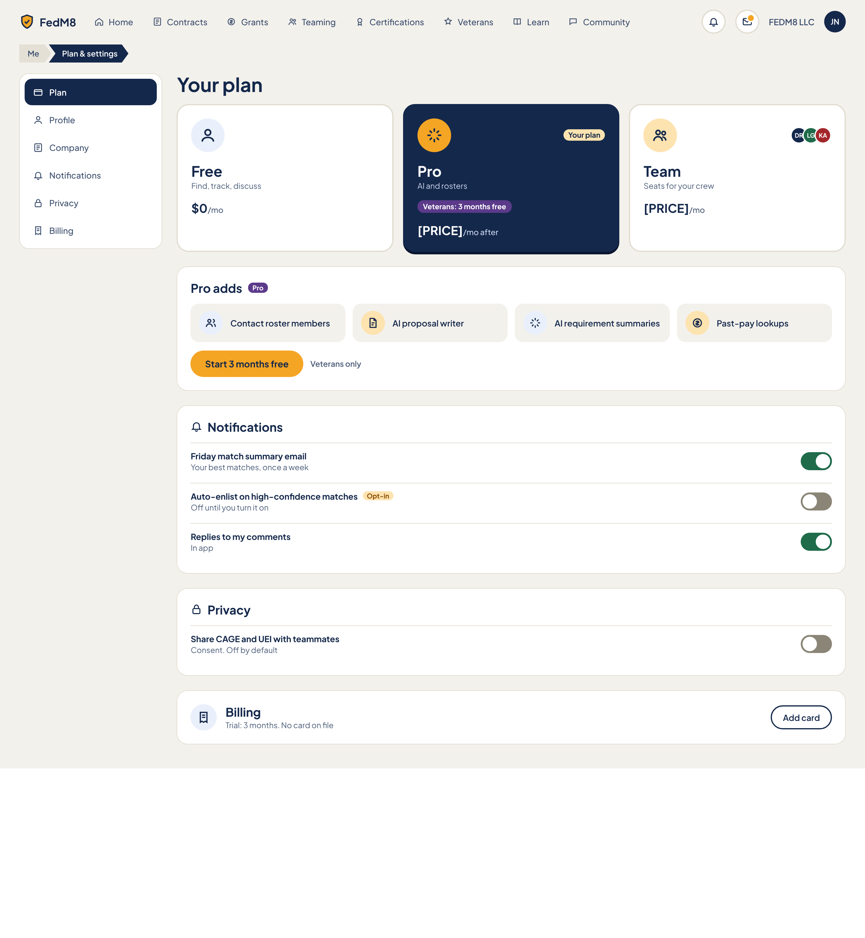
Eye path (after rules)
- 1 H1 'Your plan' (breadcrumb Me > Plan & settings sits above it, depth 2 per R4)
- 2 Plan cards: Free / Pro / Team. Pro is the selected ChoiceCard (navy = selected choice, R1). Label first (type-xl), price second (R6)
- 3 Pro adds: 4 benefits, then the single amber 'Start 3 months free' (R2)
- 4 Appearance (new): preset picker first, live preview beside it, fine controls below
- 5 Notifications toggles
- 6 Privacy toggle
- 7 Billing row with outline 'Add card' (secondary)
Change from the comp
- Pro card tag reads 'Trial' while on the free 3 months, 'Your plan' only when paid
- Tighten bottom space: page bottom padding 24px, no empty min-height; section gaps use --fm-space-6
- R1: navy only on active settings nav item and the selected plan card; Pro adds card and others are white
- R2: one amber primary on the page ('Start 3 months free'); 'Add card' stays outline
- R4: breadcrumb retained because depth is 2 (Me > Plan & settings)
- R6: plan card label first (type-xl) then price (type-md); price not large
- R8: 11px badge text ('Pro', 'Opt-in') raised to 12px badge minimum with ink passing 4.5:1; sub-lines stay 13px
- Toggle off-state track (#8a8576) must reach >=3:1 against its card background; use --fm-toggle-off-bg
- Add Appearance module and Appearance item in SettingsNav (new — not in comp)
- Replace placeholder '[PRICE]' with real price or hide the price line; never ship the literal text
- Team AvatarStack is sample decoration; replace with icon-only or real teammates
Modules (9)
- 0. App header
AppHeaderheader- FedM8 shield logo + wordmark (home link)
- PillNav with 8 pills: Home, Contracts, Grants, Teaming, Certifications, Veterans, Learn, Community (icon + label each)
- IconButton Notifications (bell)
- IconButton Messages with unread dot (amber)
- WorkspaceSwitcher label 'FEDM8 LLC'
- Avatar 'JN' (account menu)
- click a pill → navigate to that top-level page
- click logo → Home
- bell/messages → open drawer
- workspace label → switch workspace menu
- avatar → menu (Plan & settings, Sign out)
- 1. Breadcrumb
ChevronBreadcrumbheader- Segment 'Me' (link, muted)
- Segment 'Plan & settings' (current, aria-current=page)
- click 'Me' → Me / profile hub
- 2. Settings navigation
SettingsNavleft- 6 items with icon + label: Plan, Profile, Company, Notifications, Privacy, Billing
- Active item filled navy (Plan)
- Appearance item (new) added between Privacy and Billing
- click item → scroll to / open that section; URL hash updates
- Profile and Company navigate to their own pages
- arrow keys move between items
- 3. Your plan
PlanCardmain- H1 'Your plan'
- 3 PlanCards in a radio-like group: Free ($0/mo, 'Find, track, discuss'), Pro ('AI and rosters', price, '/mo after'), Team ('Seats for your crew', price, '/mo')
- Free: person icon on soft-blue circle
- Pro: sun/spark icon on amber circle, status tag, purple pill 'Veterans: 3 months free'
- Team: people icon, AvatarStack of 3 (Dana R., Luis G., Kim A.)
- Pro status tag reads 'Trial' while on the free 3 months (was 'Your plan'); 'Your plan' once paid
- select a card → aria-pressed true, card turns selected style, plan change flow starts (confirm step before billing change)
- selecting Free from Pro asks to confirm loss of Pro features
- Team opens seat-count step
- 4. Pro adds
SummaryCardmain- H2 'Pro adds' + ProTag
- 4 benefit rows (icon + label): Contact roster members, AI proposal writer, AI requirement summaries, Past-pay lookups
- PrimaryButton 'Start 3 months free'
- Note 'Veterans only'
- click Start 3 months free → verify veteran status → activate trial → Pro card flips to 'Trial'
- if not verified veteran → button hidden and 'Veterans only' replaced by upgrade link
- benefit rows are static, not links
- 5. Appearance
ThemeSwitchermain- H2 'Appearance' with paintbrush icon
- Preset picker: 4 selectable cards with mini thumbnails (Card hub default, High contrast, Dark, Compact); selected card uses selected style
- Accent colour picker: row of contrast-safe swatches only (each swatch pre-validated >=4.5:1 for action-ink on action and >=3:1 against surface); unsafe swatches are not offered
- Text size slider: --fm-type-scale 0.9 to 1.3, step 0.05, live value label (e.g. '100%'), min and max end labels
- Density SegmentedControl: Compact (0.85) / Comfortable (1) / Roomy (1.15) → --fm-density
- Corner style control: Square / Default / Round / Extra round → --fm-radius-scale 0 / 1 / 1.25 / 1.5
- Reduce motion Toggle (follows prefers-reduced-motion until user sets it)
- Live preview panel: sample header pill, ChoiceCard, NoticeRow with UrgencyChips, PrimaryButton, FilterChip pair; updates as controls change
- Contrast guard message area (inline, role=status) shown when a combination is blocked
- TextButton 'Reset to default'
- Footnote: 'Saved to your account and synced across devices'
- choose preset → all tokens swap at once, per-control overrides cleared, preview and whole app update without reload
- pick accent swatch → sets action/accent tokens; if resulting pair fails 4.5:1 text contrast the change is rejected, previous value kept, guard message names the failing pair
- move text-size slider → --fm-type-scale updates live while dragging; clamped to 0.9–1.3; keyboard arrows step 0.05
- pick density → --fm-density updates spacing live
- pick corner style → --fm-radius-scale updates live
- toggle reduce motion → --fm-motion-fast/base set to 0ms and transitions removed
- Reset to default → confirms, restores Card hub preset with no overrides
- every change auto-saves (debounced 500ms) to the user's theme JSON and applies on other signed-in devices
- offline change → applied locally, queued, synced on reconnect
- 6. Notifications
Togglemain- H2 'Notifications' with bell icon
- Toggle row 'Friday match summary email' + sub 'Your best matches, once a week' (on)
- Toggle row 'Auto-enlist on high-confidence matches' + 'Opt-in' badge + sub 'Off until you turn it on' (off)
- Toggle row 'Replies to my comments' + sub 'In app' (on)
- click or Space on a switch → flips, saves immediately, announces state
- turning on Auto-enlist shows a one-line consent confirm before saving
- 7. Privacy
Togglemain- H2 'Privacy' with lock icon
- Toggle row 'Share CAGE and UEI with teammates' + sub 'Consent. Off by default' (off)
- flip switch → saves consent with timestamp; turning off revokes immediately
- 8. Billing
SettingsNavmain- Receipt icon on soft-blue circle
- H2 'Billing'
- Status line 'Trial: 3 months. No card on file'
- SecondaryButton (outline) 'Add card'
- click Add card → hosted payment form (provider TBD); on success status line updates to card brand and last 4
Features (19)
- Choose Free / Pro / Team plan
- Veterans start a 3 month Pro trial without a card
- Trial status label on the Pro card
- View what Pro adds (4 benefits)
- Appearance: 4 presets (Card hub default, High contrast, Dark, Compact)
- Appearance: contrast-safe accent colour swatches only
- Appearance: text size slider 0.9–1.3 (--fm-type-scale)
- Appearance: density compact / comfortable / roomy (--fm-density)
- Appearance: corner style (--fm-radius-scale)
- Appearance: reduce motion toggle
- Appearance: live preview
- Appearance: Reset to default
- Appearance: saved per user and synced across devices
- Toggle weekly match summary email
- Toggle auto-enlist on high-confidence matches (opt-in, default off)
- Toggle reply notifications
- Toggle sharing CAGE and UEI with teammates (consent, default off)
- Add a payment card
- Settings side navigation to Plan, Profile, Company, Notifications, Privacy, Appearance, Billing
Acceptance checklist (36)
Responsive · accessibility · open questions
<=1024px: SettingsNav becomes a horizontal scrollable SegmentedControl above the content (44px targets); plan cards stack 1 or 2 per row; Appearance preview moves below the controls. <=480px: single column, 16px gutter, plan cards full width, toggles keep 44px rows, breadcrumb collapses to back arrow plus current segment, header PillNav moves to BottomTabBar (Home, Contracts, Teaming, Community, Me).
- Landmarks: header (banner), nav 'Main', nav 'Settings', main with a section per module labelled by its H2
- Plan cards are a role=radiogroup (or aria-pressed buttons) with a roving tabindex and a visible --fm-focus-ring
- Switches use role=switch with aria-checked and aria-labelledby; state changes announced
- Slider uses native input range or role=slider with aria-valuemin/max/now and a text value
- Contrast-guard message uses role=status so it is announced
- Selected presets and swatches show a ring plus check mark, never colour alone
- Tab order: header, breadcrumb, settings nav, plan, Pro adds, Appearance, Notifications, Privacy, Billing
- Final Pro and Team prices
- Exact contrast thresholds for the guard (assumed 4.5:1 text, 3:1 UI) and the swatch palette list
- Should theme apply to logged-out marketing pages
- Are Profile and Company separate pages or sections here
- Billing provider and trial-to-paid flow
- Does Team plan need a seat management screen in v1
Mobile · Home
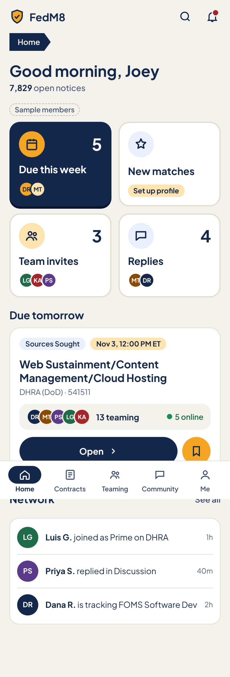
Eye path (after rules)
- 1 H1 'Good morning, <name>' (no breadcrumb at depth 1, R4)
- 2 'Your day' 2x2 StatCards: Due this week, New matches, Team invites, Replies (big numbers only here, R6)
- 3 'Due tomorrow' card: urgency chip, title, agency, team strip, amber Open + bookmark icon button
- 4 Network activity list
- 5 BottomTabBar (Home active)
Change from the comp
- R4: remove the 'Home' ChevronBreadcrumb; top-level page starts with the H1
- R2/page note: 'Open' becomes the single amber PrimaryButton; bookmark becomes an outline IconButton (was amber)
- R1: 'Due this week' StatCard is no longer navy-filled; use surface with --fm-accent-soft icon circle (navy is only for where-you-are)
- R5: urgency chip colour driven by time left (<=48h --fm-urgent-soft/--fm-urgent text); the comp's amber chip becomes the urgent style
- R6/R9: big numbers only on StatCards; New matches shows no number; unknown counts hidden, not shown as 0
- R8: relative timestamps (12px) raised to 13px; badge text min 12px
- Remove 'Sample members' chip from shipped build; real avatar data or hide stacks
- Make the bell dot --fm-urgent and give it a number-free accessible label
Modules (6)
- 0. App bar
AppHeaderheader- FedM8 logo and wordmark (home link)
- IconButton Search
- IconButton Notifications with red unread dot
- Search → full-screen search
- Notifications → notifications drawer
- logo → Home
- 1. Greeting and open count
PageTitlemain- H1 'Good morning, Joey' (time-of-day word and first name)
- Sub-line '<N> open notices' with tabular number
- tap sub-line → Contracts list
- 2. Your day
StatCardmain social- 2x2 grid of 4 tappable StatCards, min height 140px
- Due this week: calendar icon, number, label, AvatarStack of 2 (Dana R., Marcus T.)
- New matches: star icon, label, badge 'Set up profile' (no number until matching is set up)
- Team invites: people icon, number, label, AvatarStack of 3
- Replies: chat icon, number, label, AvatarStack of 2
- Comp-only SampleChip 'Sample members' above the grid (must not ship)
- tap Due this week → Contracts filtered to due <=7 days
- tap New matches → profile setup if incomplete, else matches list
- tap Team invites → Teaming invites
- tap Replies → Community replies inbox
- 3. Due tomorrow
NoticeRowmain social- H2 'Due tomorrow'
- TypeBadge 'Sources Sought'
- UrgencyChip 'Nov 3, 12:00 PM ET' (<=48h → --fm-urgent per R5)
- Title 'Web Sustainment/Content Management/Cloud Hosting'
- Agency line 'DHRA (DoD) · 541511'
- TrackingBar: AvatarStack of 5, '13 teaming', green dot '5 online'
- PrimaryButton 'Open' (amber, full width minus icon button)
- IconButton bookmark (Track), 48px, outline
- tap Open or card title → mobile contract detail
- tap bookmark → toggles tracking, icon fills, toast 'Tracking'
- tap team strip → Team tab of the contract
- 4. Network
ActivityFeedItemmain social- H2 'Network' with TextButton 'See all'
- 3 ActivityFeedItems: avatar, bold name + action text, relative time (1h / 40m / 2h)
- Items: 'Luis G. joined as Prime on DHRA', 'Priya S. replied in Discussion', 'Dana R. is tracking FOMS Software Dev'
- tap an item → the related contract or thread
- See all → full activity feed
- 5. Bottom tab bar
BottomTabBarbottom- 5 tabs with icon + label: Home, Contracts, Teaming, Community, Me
- Active tab: navy pill behind icon, bold label
- tap tab → top-level page; re-tap active tab scrolls to top
Features (11)
- Time-of-day greeting with first name
- Open notices count
- 4 glanceable counters: Due this week, New matches, Team invites, Replies
- Deep links from each counter
- Due tomorrow contract card with urgency chip
- Open contract in one tap
- Track (bookmark) in one tap
- Team presence on the card (teaming count, online count)
- Network activity feed with See all
- Search and notifications in app bar
- 5 item bottom tab bar
Acceptance checklist (23)
Responsive · accessibility · open questions
Designed for 390px. >=768px: switch to the desktop Home layout (PillNav, wider grid). 320px: StatCards stay 2 columns with label wrapping to 2 lines; avatar stacks drop to 2 avatars. Safe-area insets respected on the bottom bar.
- Landmarks: header, main, nav 'Main' (bottom bar)
- Each StatCard is one link with an accessible name including the count, e.g. 'Due this week, 5'
- Avatar stacks have role=img with names; decorative initials are aria-hidden
- Online status has text '5 online' beside the dot
- Bookmark button uses aria-pressed and label 'Track'
- Focus order: app bar, H1, stat cards, due card (Open then bookmark), network list, bottom tabs
- Tap targets >=44px
- Is 'Good morning' time-of-day aware or fixed
- What if several notices are due tomorrow: carousel, or list with See all
- Definition of 'New matches' and when the number appears
- Does 7,829 refer to all open notices or to those matching the user
- Who counts as 'Network' (teammates, followed users, everyone)
Mobile · Contract detail
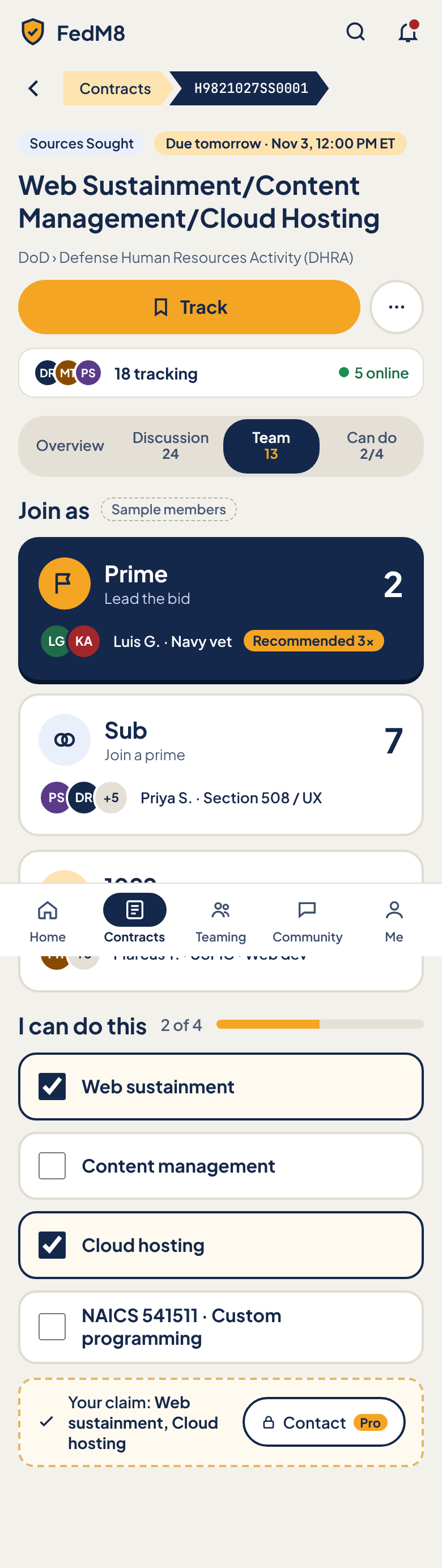
Eye path (after rules)
- 1 Back arrow + breadcrumb Contracts > solicitation # (depth 2, R4)
- 2 Type badge + countdown chip, title, agency line (R3 step 1)
- 3 Track (the one amber button) + More
- 4 Who is here strip (18 tracking, 5 online)
- 5 3-part SegmentedControl: Overview · Talk 24 · Team 13
- 6 Overview: Summary (BLUF) → Can you do this? (R3)
- 7 Team: Join as (3 ChoiceCards), then claim bar and Pro Contact
- 8 Talk: Discussion thread list
- 9 BottomTabBar (Contracts active)
Change from the comp
- Segmented control reduced from 4 to 3: Overview · Talk 24 · Team 13; 'Can do' moves into Team (comp says: put 'Can do' inside Team)
- Flag for owner: R3 orders the detail page Summary → Can you do this → Join as → Discussion; this spec puts Summary + Can do in Overview and Join as + claim in Team per the page note, so the Can do list shows in both Overview preview and Team; confirm
- Add SummaryCard (BLUF) which the comp omits (R3)
- R3: facts collapse to one FactLine
- R5: countdown chip uses urgency colours; comp amber chip becomes --fm-urgent at <=48h
- R6: Join as counts (30px) become type-md muted with unit word, below the label
- R1: only the selected Join-as card is navy; selected segment uses --fm-chip-selected-bg not navy; checked requirement rows use --fm-success-soft
- R2: Track stays the only amber button; the Contact button is outline and its Pro tag uses --fm-pro
- R7: no navy-filled chips
- R8: segment count text 12px raised to 13px; meta lines 13px with 4.5:1
- Remove SampleChip 'Sample members' for production
- Segment labels single line (no two-line cramped labels)
Modules (10)
- 0. App bar
AppHeaderheader- FedM8 logo
- IconButton Search
- IconButton Notifications with unread dot
- Search → search overlay
- Notifications → drawer
- 1. Back and breadcrumb
ChevronBreadcrumbheader- Back arrow IconButton (label 'Back to Contracts')
- Segment 'Contracts' (link, accent-soft)
- Segment solicitation number in mono (current, e.g. H9821027SS0001)
- back arrow or 'Contracts' segment → Contracts list keeping prior filters and scroll
- 2. Notice header
CountdownBannermain- TypeBadge 'Sources Sought'
- UrgencyChip 'Due tomorrow · Nov 3, 12:00 PM ET' (<=48h → --fm-urgent per R5)
- H1 title 'Web Sustainment/Content Management/Cloud Hosting'
- Agency path 'DoD › Defense Human Resources Activity (DHRA)'
- PrimaryButton 'Track' (full width, bookmark icon)
- IconButton 'More actions' (outline, 48px)
- Track → toggles tracking; label becomes 'Tracking' with filled icon
- More → bottom sheet: Share, Open on SAM.gov, Save, Report
- countdown updates live; at <=48h turns urgent, <=7d warn, later neutral
- 3. Who is here
TrackingBarmain social- AvatarStack of 3
- '18 tracking' (bold)
- green dot + '5 online'
- tap → opens Team tab
- 4. Sections
SegmentedControlmain social- 3 segments only: Overview, Talk 24, Team 13 (count on the same line as the label, 13px)
- Selected segment: chip-selected style (cream), others transparent
- tap segment → swaps panel below, keeps scroll at the control
- arrow keys move between segments; panel focus moves to panel heading
- selected segment kept in URL (?tab=)
- 5. Summary (BLUF)
SummaryCardmain Pro- Heading 'Summary'
- AI BLUF text, 2–4 lines
- ProTag if AI summary is a Pro feature
- FactLine: agency · NAICS · set-aside · due date (single collapsed line)
- Expand control for facts
- tap FactLine → expands full facts
- Pro gate → ProLock with upgrade link for free users
- 6. I can do this
RequirementTogglemain Pro social- H2 'I can do this' with '2 of 4' and CoverageMeter bar
- 4 RequirementToggles (checkbox rows, 60px min): Web sustainment (on), Content management (off), Cloud hosting (on), 'NAICS 541511 · Custom programming' (off)
- ClaimBar: check icon + 'Your claim: Web sustainment, Cloud hosting' + outline 'Contact' button with Pro tag
- toggle a requirement → saves at once, meter and claim text update, count in claim bar updates
- tap Contact → if Pro, opens contact sheet for roster members who claim the same; if free, shows ProLock upgrade prompt
- claim visible to team after save
- 7. Join as
JoinAsPickermain social- H2 'Join as'; comp-only SampleChip 'Sample members' (must not ship)
- 3 stacked ChoiceCards: Prime ('Lead the bid'), Sub ('Join a prime'), 1099 ('Contract by the task')
- Each card: icon circle, label (type-xl) first, count second (type-md muted with unit word, e.g. '2 people')
- AvatarStack per role plus top member line (e.g. 'Luis G. · Navy vet', 'Priya S. · Section 508 / UX', 'Marcus T. · USMC · Web dev')
- 'Recommended 3×' chip on Prime
- tap a card → selects role (single choice), updates ClaimBar and roster link
- tap avatar stack → roster for that role
- tap selected card again → keeps selection (no deselect) unless user taps 'Leave'
- 8. Talk (Discussion)
ThreadListmain social- SortTabs Hot/New/Top
- ThreadPost list with VoteRail, author, RoleBadge, time, body
- BotPost slot (FedM8 AI)
- Composer (sticky, above bottom bar)
- vote, reply, share, save
- post a comment
- tab count updates after posting
- 9. Bottom tab bar
BottomTabBarbottom- 5 tabs: Home, Contracts, Teaming, Community, Me
- Contracts active with navy pill
- tap tab → top-level page; tapping active Contracts returns to the list
Features (15)
- Back to Contracts list
- Breadcrumb Contracts > solicitation #
- Type badge and live countdown with urgency colour
- Track / untrack (single amber action)
- More actions sheet
- Who is here: tracking count and online count
- 3-way section switch: Overview, Talk, Team
- AI summary (BLUF) with pending/ready/failed states
- Per-requirement 'I can do this' toggles with coverage meter
- Claim bar summarising claims
- Contact roster members (Pro)
- Join as Prime / Sub / 1099
- Recommended-role chip
- Roster avatar stacks per role
- Discussion thread with voting and composer
Acceptance checklist (28)
Responsive · accessibility · open questions
Designed for 390px. >=768px: switch to the desktop contract detail (two-column with right rail). 320px: section control keeps 3 segments with 13px labels; ChoiceCards stay stacked; claim bar wraps Contact below the claim text.
- Landmarks: header, main, nav 'Main'; breadcrumb is ol with aria-current=page on the last item
- Section control: use role=tablist/tab/tabpanel with arrow-key navigation, or aria-pressed buttons with panels labelled
- Join-as cards are a radiogroup; selection announced
- Requirement rows are native checkboxes inside labels
- Meter has text '2 of 4' (not colour alone)
- Urgency chip includes text, not only colour
- Pro-locked controls explain why they are locked via aria-describedby
- Focus order follows eye path; tap targets >=44px
- Where Summary sits when Overview is not selected (R3 wants it before Can-do and Join-as)
- Does 'Can do' appear only in Team (per page note) or also as a preview in Overview
- How requirements are produced (AI parse vs manual) and who can edit them
- Can a user hold more than one role on the same contract
- Is the AI summary Pro-only on mobile
- Grant detail uses the same mobile pattern?
Mobile · Community
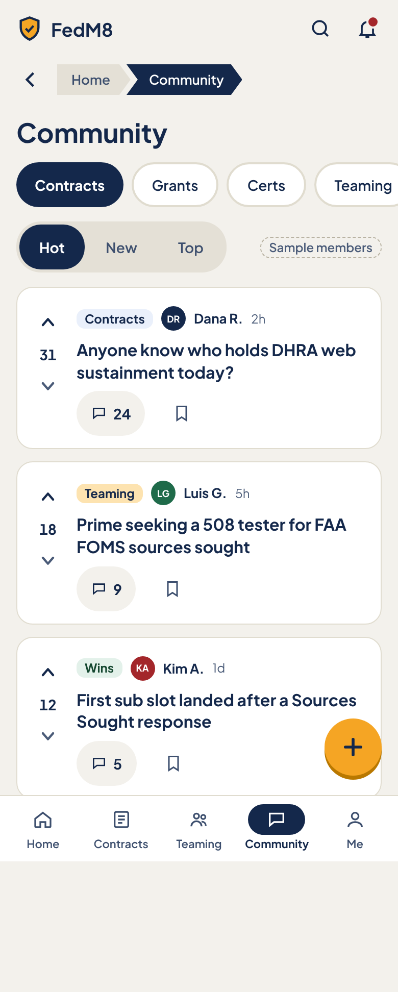
Eye path (after rules)
- 1 H1 'Community' (top-level tab, no breadcrumb or back arrow, R4)
- 2 Spaces chips: Contracts, Grants, Certs, Teaming, Wins
- 3 Sort: Hot / New / Top
- 4 Post cards: vote rail, space tag, author, time, title, comments, save
- 5 FAB '+' (the one amber action, R2)
- 6 BottomTabBar (Community active)
Change from the comp
- R4: remove the 'Home > Community' breadcrumb and back arrow; Community is a bottom-tab destination so the page starts with the H1
- Page note: add bottom padding equal to the FAB height (56px) plus bar clearance so the last card's actions are not overlapped
- R7: space chips and sort control use --fm-chip-selected-bg for selected, not navy fill
- R2: the FAB is the single amber action
- R8: relative timestamps and badge text (12px) raised to 13px (badges 12px with 4.5:1); tag ink for Wins uses --fm-success on --fm-success-soft
- Remove SampleChip 'Sample members' for production
- Space tags carry text, not colour only; ensure each tag pair passes 4.5:1
- Vote arrows: downvote arrow colour uses --fm-ink-3 (4.5:1)
Modules (7)
- 0. App bar
AppHeaderheader- FedM8 logo
- IconButton Search
- IconButton Notifications with unread dot
- Search → searches posts and spaces
- Notifications → drawer
- 1. Page title
PageTitlemain- H1 'Community' (type-2xl on mobile)
- 2. Spaces
FilterChipmain social- Horizontally scrollable row of 5 chips: Contracts, Grants, Certs, Teaming, Wins
- Selected chip filled with chip-selected style; others outline
- Right edge fade hints scroll
- tap chip → loads that space's posts, resets sort to Hot, keeps scroll at top
- swipe row to reveal more spaces
- selected chip scrolls into view
- 3. Sort
SortTabsmain social- SegmentedControl Hot / New / Top (44px targets)
- Comp-only SampleChip 'Sample members' at right (must not ship)
- tap → re-sorts the list without page reload; selection remembered per space for the session
- 4. Posts
ThreadPostmain social- List of PostCards (3 in comp): VoteRail (Upvote, score, Downvote), space tag (Contracts / Teaming / Wins with distinct soft colour plus text), author Avatar + name + relative time, title link (type-md bold), comment count button, Save icon button
- Post 1: Contracts · Dana R. · 2h · 'Anyone know who holds DHRA web sustainment today?' · 31 votes · 24 comments
- Post 2: Teaming · Luis G. · 5h · 'Prime seeking a 508 tester for FAA FOMS sources sought' · 18 votes · 9 comments
- Post 3: Wins · Kim A. · 1d · 'First sub slot landed after a Sources Sought response' · 12 votes · 5 comments
- Last card has bottom padding equal to FAB height plus bar so actions are never covered
- tap title or comment count → thread detail
- tap Upvote/Downvote → toggles vote, score updates optimistically, second tap removes vote
- tap Save → toggles saved, toast 'Saved'
- tap author → profile card
- pull to refresh; infinite scroll loads next page
- 5. New post
FABoverlay social- 56px amber circular button with plus icon, label 'New post' (accessible name)
- Sits 16px from the right, above the bottom bar
- tap → Composer sheet (space picker defaults to the current space, title, body, Post)
- hides while scrolling down, shows when scrolling up (optional)
- 6. Bottom tab bar
BottomTabBarbottom- 5 tabs: Home, Contracts, Teaming, Community, Me
- Community active with navy pill
- tap tab → top-level page; tapping active Community scrolls to top
Features (10)
- Browse by space (Contracts, Grants, Certs, Teaming, Wins)
- Sort Hot / New / Top
- Upvote and downvote posts
- See comment counts and open threads
- Save a post
- Start a new post
- Author avatar, name and relative time on every post
- Space tag on every post
- Search and notifications in app bar
- Infinite scroll and pull to refresh
Acceptance checklist (23)
Responsive · accessibility · open questions
Designed for 390px. >=768px: switch to desktop Community (left rail of spaces, centre feed, right rail). 320px: author line wraps to two lines; vote rail stays 44px; Spaces row keeps scrolling. Safe-area insets respected for the FAB and bar.
- Landmarks: header, main, nav 'Main'; posts in a list with each article labelled by its title
- Spaces and Sort are groups with aria-pressed buttons; group labelled 'Spaces' and 'Sort'
- Vote buttons labelled 'Upvote' / 'Downvote' with aria-pressed and the score announced (e.g. 'Score 31')
- Comment button label '24 comments'; Save label 'Save' / 'Saved'
- FAB has an accessible name and is reachable by keyboard in logical order
- Space tag text is read, not only coloured
- Tap targets >=44px; focus ring visible
- Hot ranking formula
- Is 'Certs' space the same as Certifications
- Do downvotes exist for all spaces or only some
- Moderation and reporting entry point on posts
- Should posts show a preview body or only titles
- Does the FAB hide on scroll